New Balance Minimus Shoes

A few weeks ago I attended the John Keatley Survival Guide business workshop held at Rob Grimm's studio in St. Louis. One of the many things we talked about was creating a since of style in our photography.

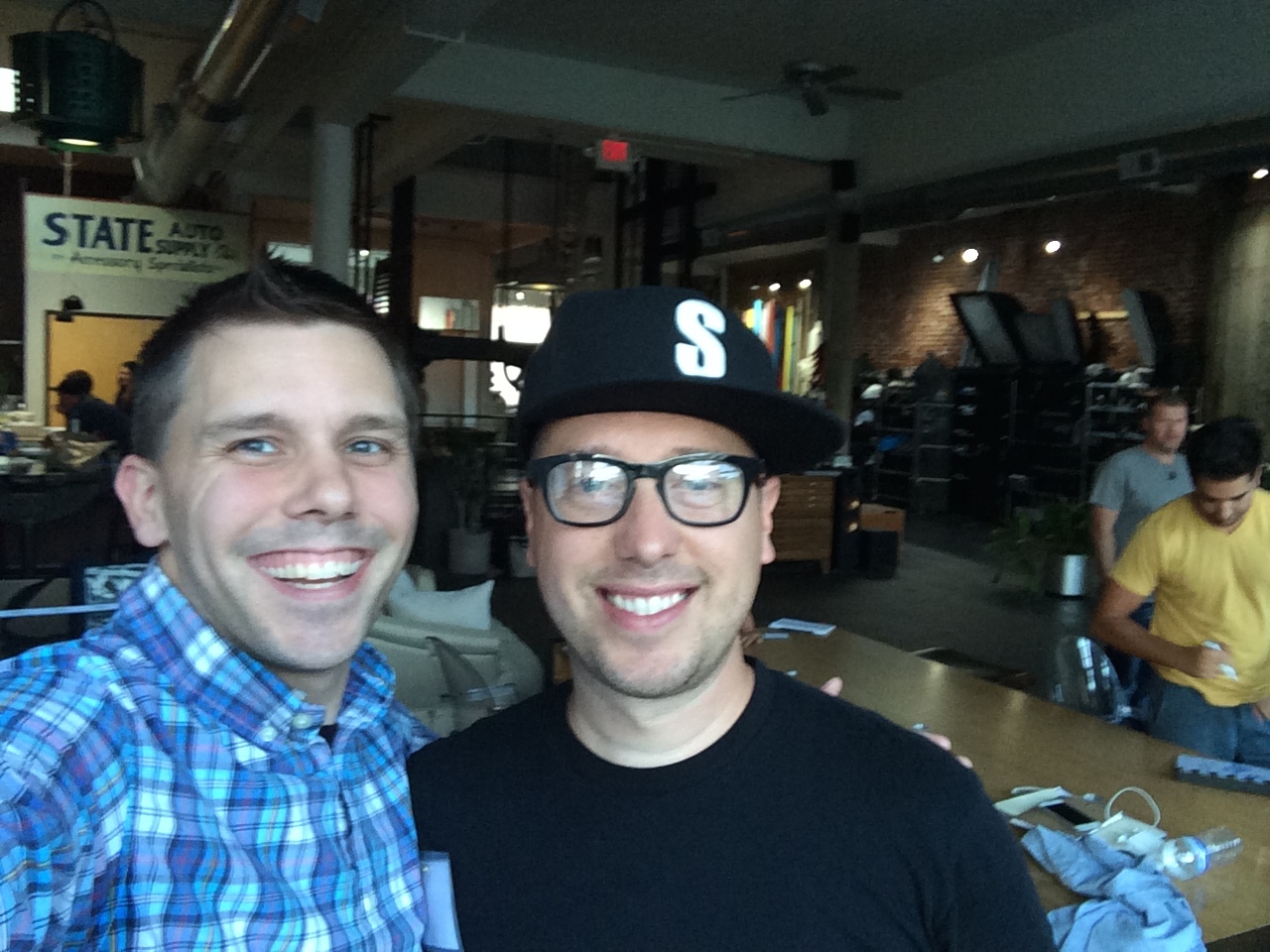
John Keatley and I in St Louis during the Survival Guide workshop at Rob Grimm's studio.

John Keatley and I in St Louis during the Survival Guide workshop at Rob Grimm's studio.

I tried to take that to heart and thought a lot about what I enjoyed taking photographs of as well as how I can integrate Photoshop compositing into my product photographs. Once I narrowed the ideas down on my four hour dive home my brain has exploded with ideas.

My normal process of product photography, although complex, has been fairly simple by comparison.

My goal is to do a several photographs with the product composited in a scene. I have a good but evolving idea of the theme I would like for the scenes but I will talk about that further as I progress.

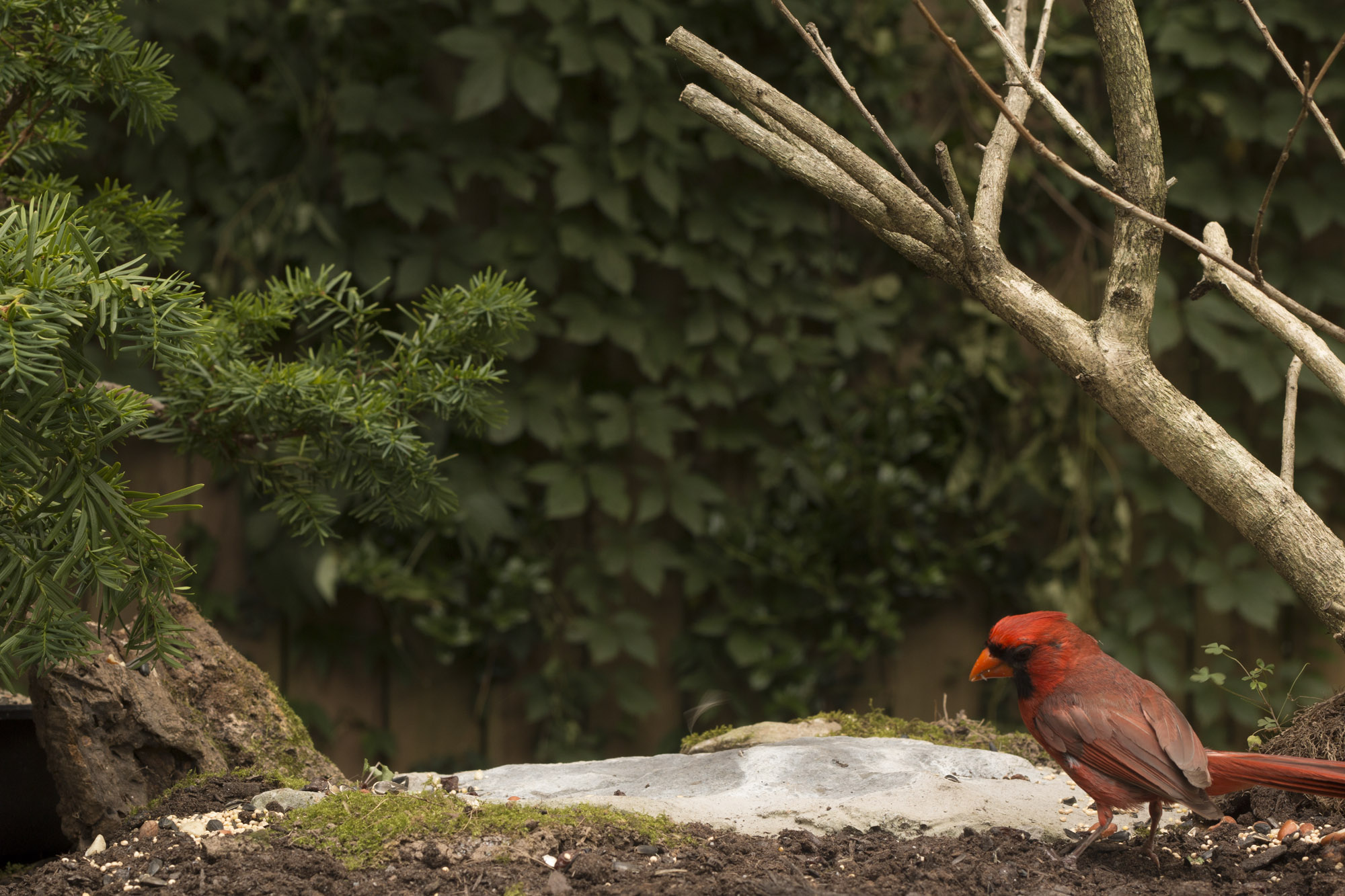
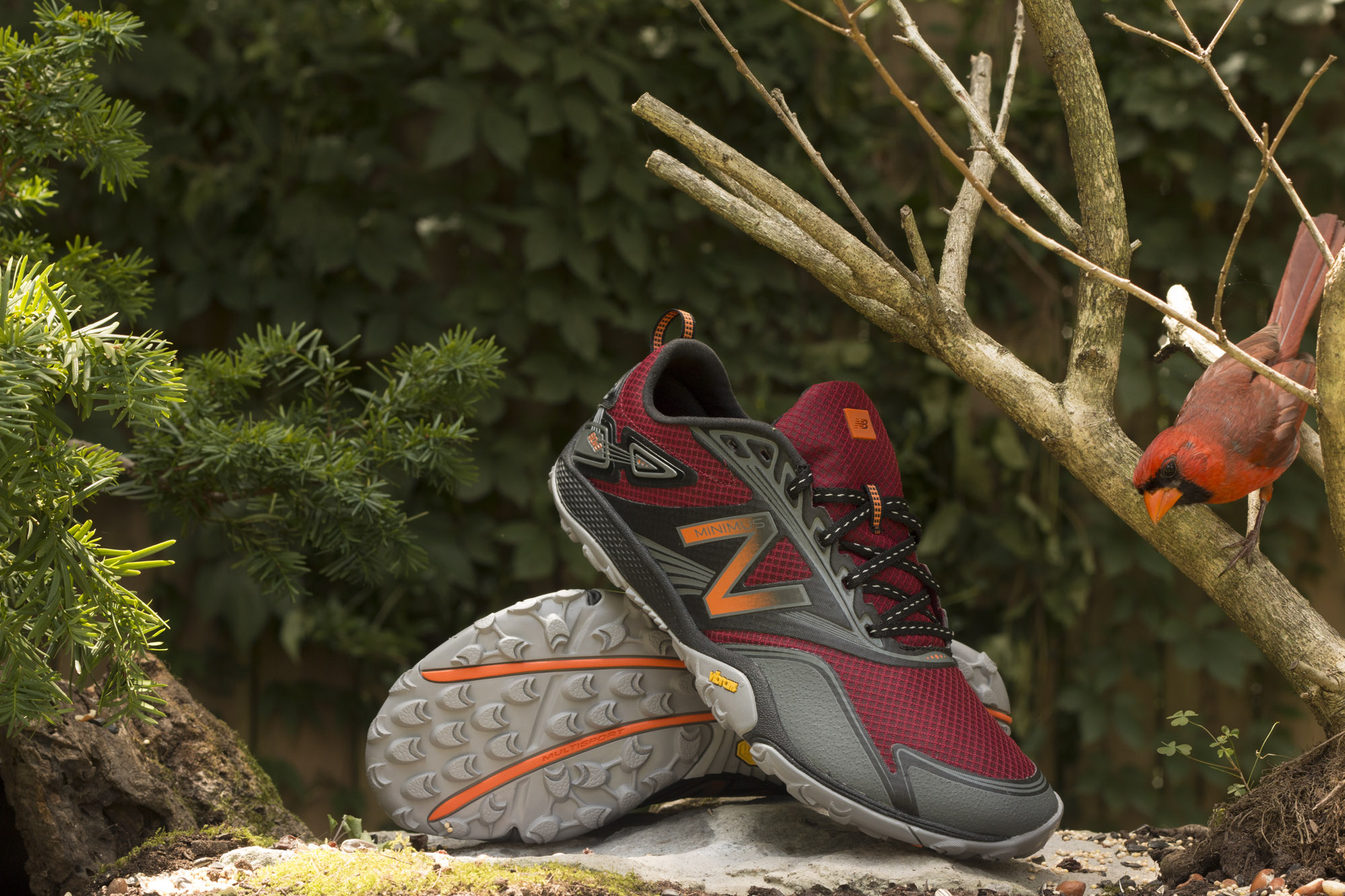
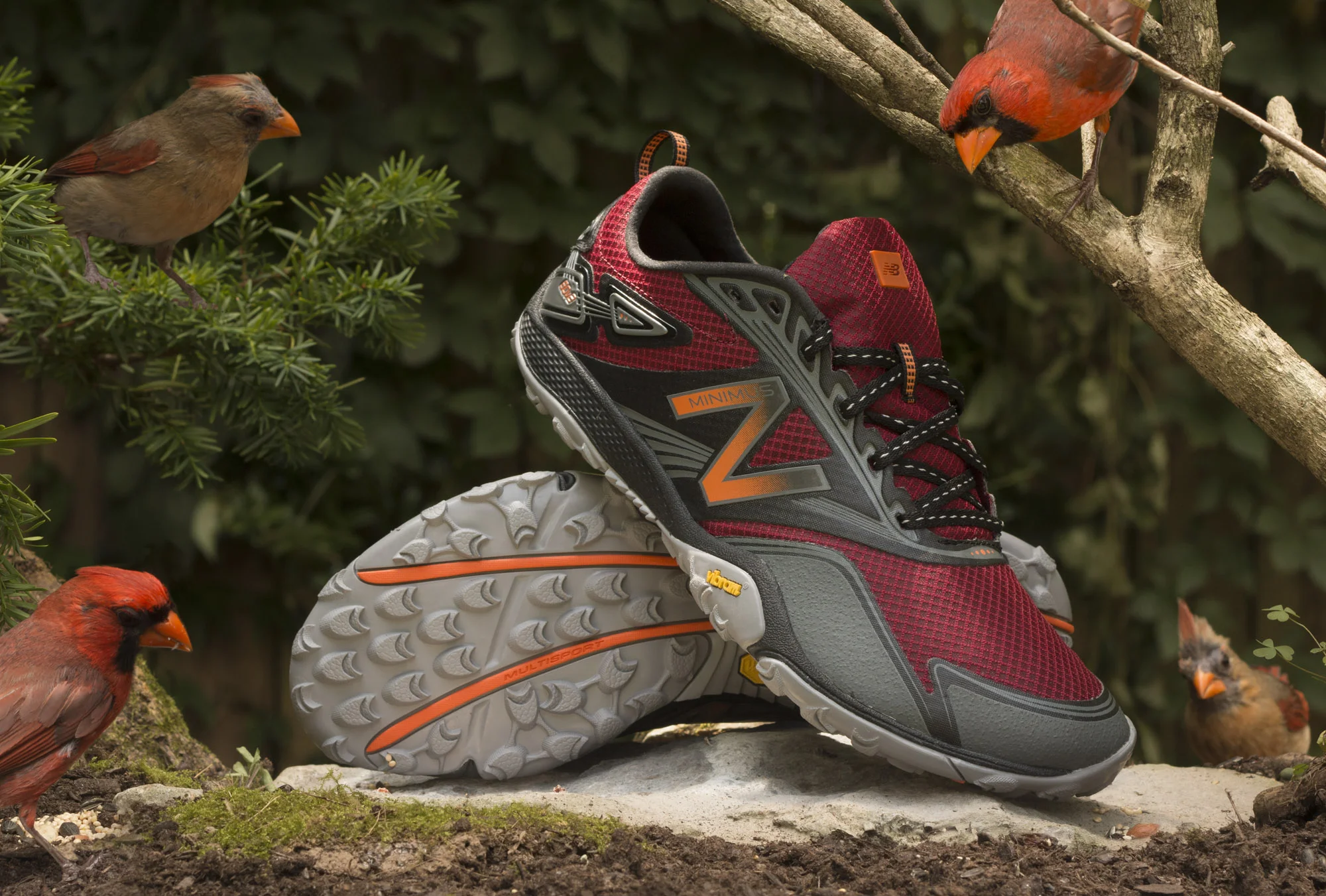
For this photo the idea was to combine an out door scene with birds looking at and admiring red New Balance Minimus shoes. I wanted it to feel as if the birds were reconsidering this whole walking thing. I wanted red shoes to contrast the green of the planed background. Also, I had seen a pair of cardinals living near my house would work perfect to compliment the shoes. Assuming I could entice the birds to have their picture taken.

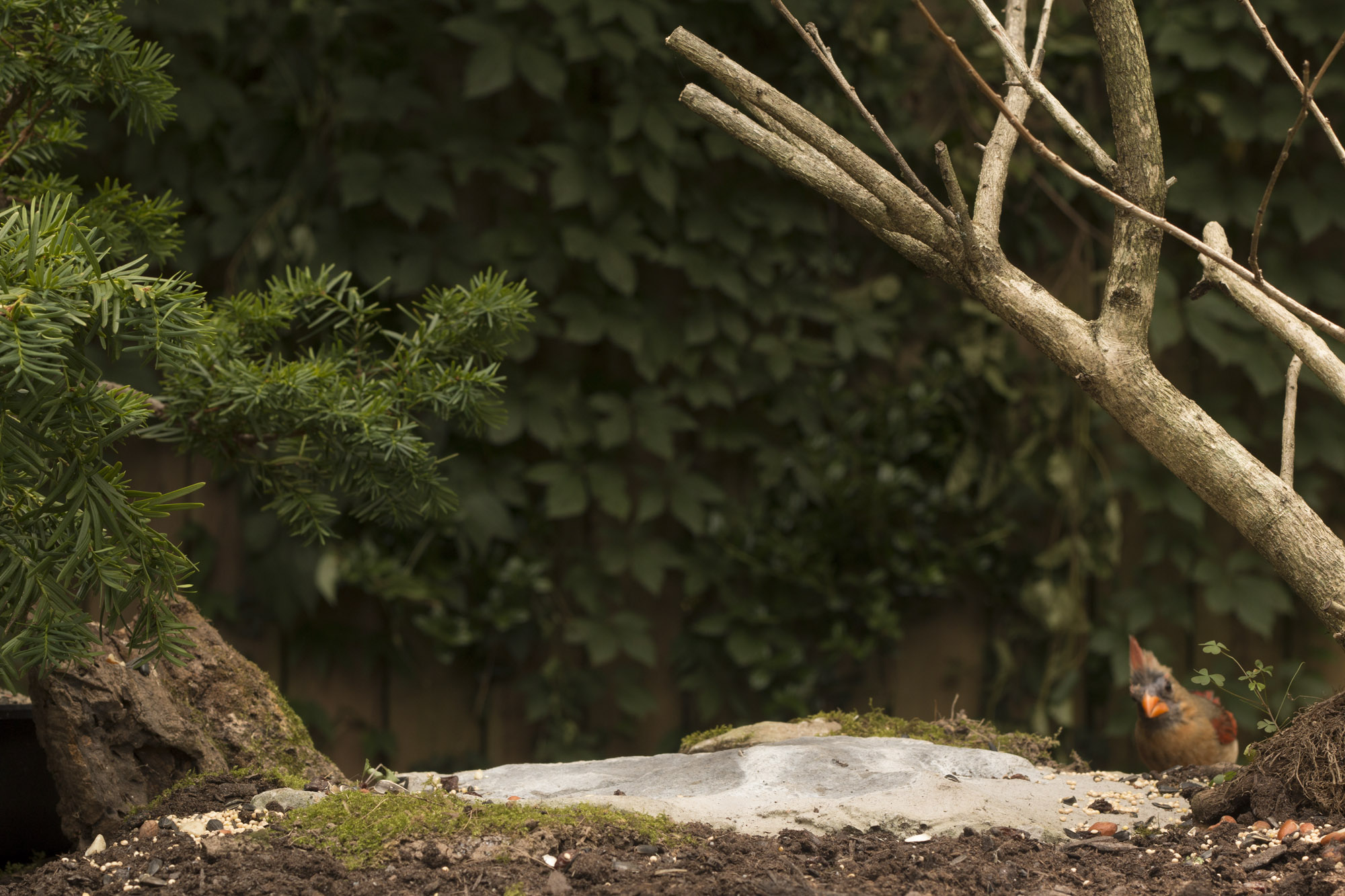
I ordered the shoes and started building a set that I could leave outside. I got a flat stone to put the shoes on, surrounded it with dirt and moss, put a dead leafless bush on one side and a potted plant (a yew) on the other side. I moved the whole setup to the fence in the back of my Nashville home. I then added some foliage to the fence to fill in gaps in the already existing greenery and some seeds to the table to attracted the birds.

Then I waited... four days till birds finally realized there was a ton of food on the table and my tripod was not there to eat them.

After I saw enough birds partaking in seeds, I set up my camera with a remote. Slowly over the next four hours birds flew in and out of the scene eating seeds. I finished up the day by removing all the seeds I could and placing my shoes on the set to get a shadow on the rock so it would be easier to composite the shoes into the scene.

The next day I went about taking photos of the shoes inside my studio. I took the stone from my set outside. (It had to be dried with a hairdrier because it had rained all night.) I used the overlay option in Capture One to get the stone is a position as close as possible as what it was on set. I then did the same for the shoes.

My goal with lighting the shoes separately was to control the light to make the shoes pop more and seem very dynamic, but I needed to keep it fairly consistent with the light from outside for continuity. I set up three lights: a large softbox from above, a 20 degree gridded light on the right and a 10 degree gridded light on the left slightly behind the hill.

Then I started combining it all in Photoshop. I had to move some of the birds but that was made easier by the consistency of the light on the set. After I added the shoes I thought I was about done but I was bothered by the lack of foliage on the right side. I went back outside set up my camera on a remote and used the potted yew to build foliage around the limbs of the dead bush on the right.

Happy with the results I composited those photographs in and finished the image by cleaning and toning.

I'm really excited about the results. Not simply because it came out well but also by how close it was to what I had pre-visualized. I think its a great start to a new direction for my photography.

"I can do better"

Tuesday morning I woke up and thought to myself, “I can do better.”

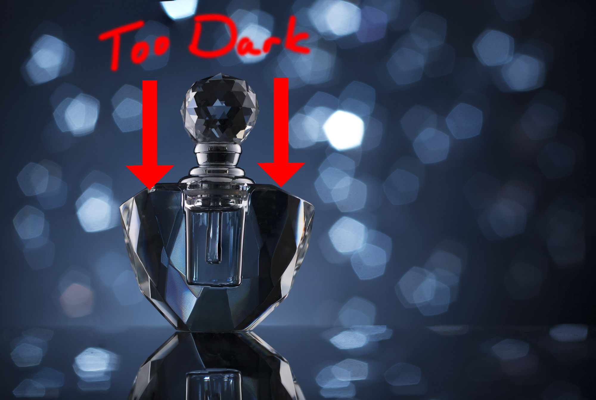
I had taken photos of a $3.99 crystal perfume bottle and the more I looked at it the more I thought the lighting was just not right. I had wanted a dark and moody night time feel for the product photograph but I thought the sides of the bottle were just too black. My plan was to finish it in photoshop that morning and start on something else, but it was nagging at me.

So I sipped my coffee and looked at it... I was out of packing tape which I needed and I needed to mow the grass too... and go!

I ran to Walgreens for the tape and the gas station.

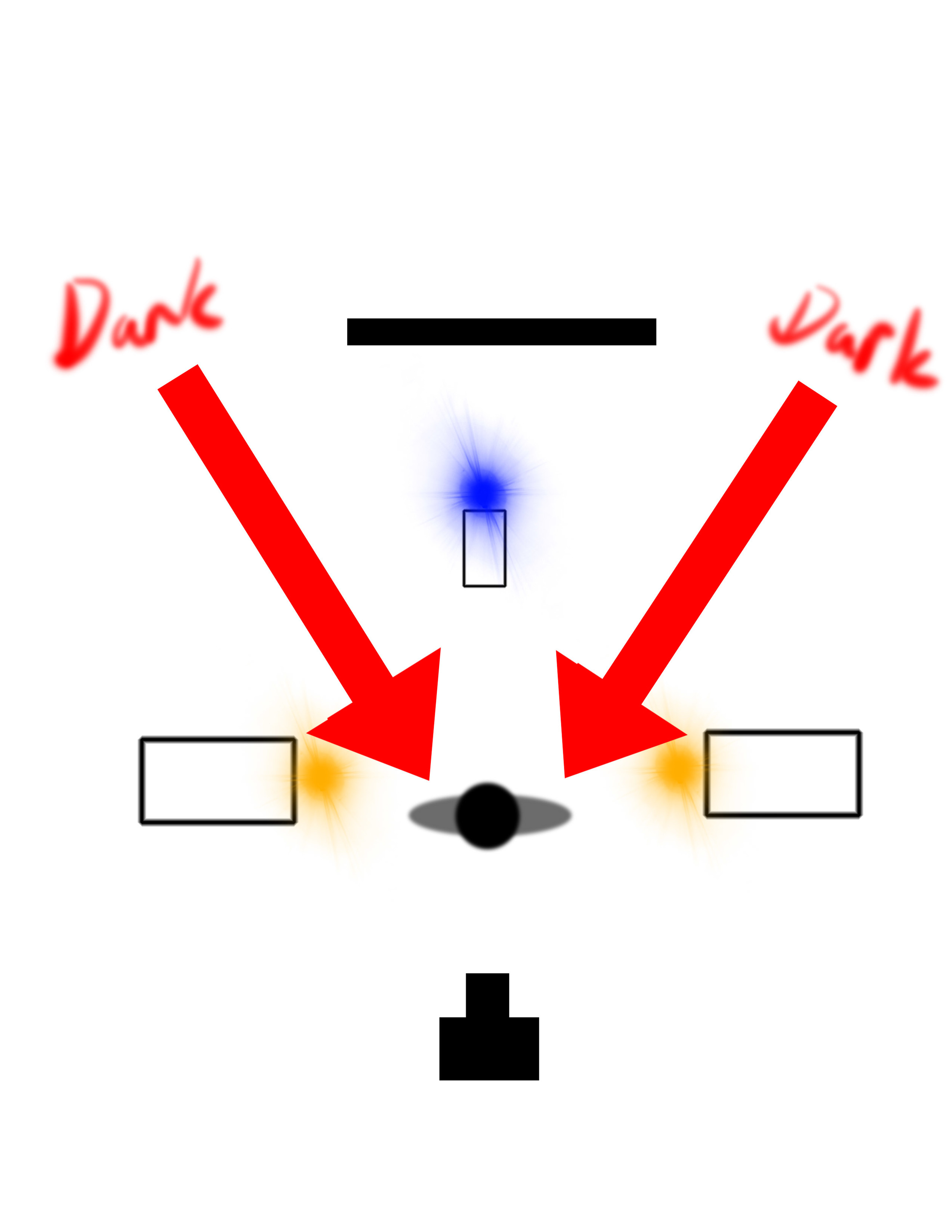
The problem I had with the photo was the black areas on either side of the center. These areas are refracted through the crystal. They represent the area between light coming from the background and the lights coming from the sides meant to light the subject.

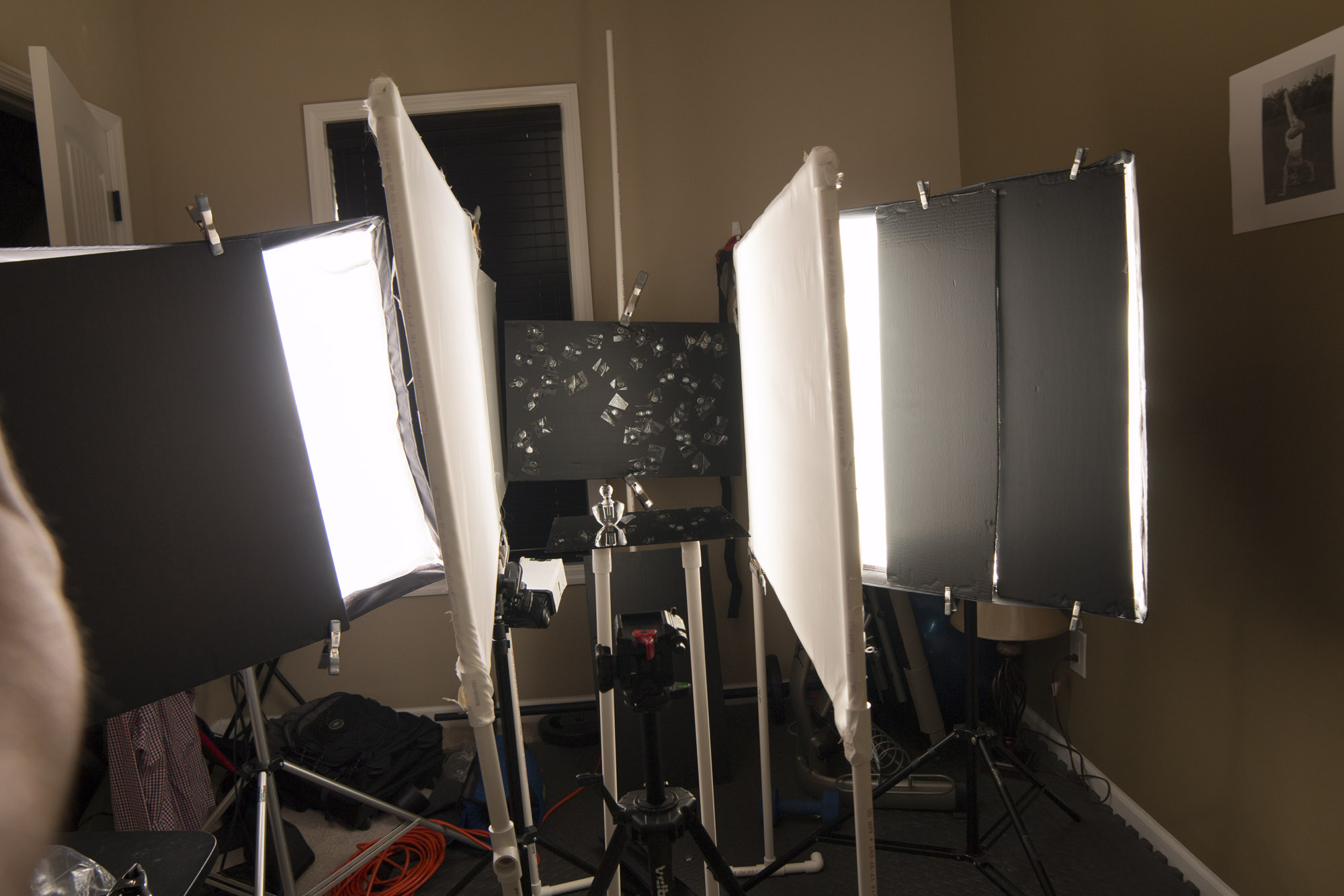
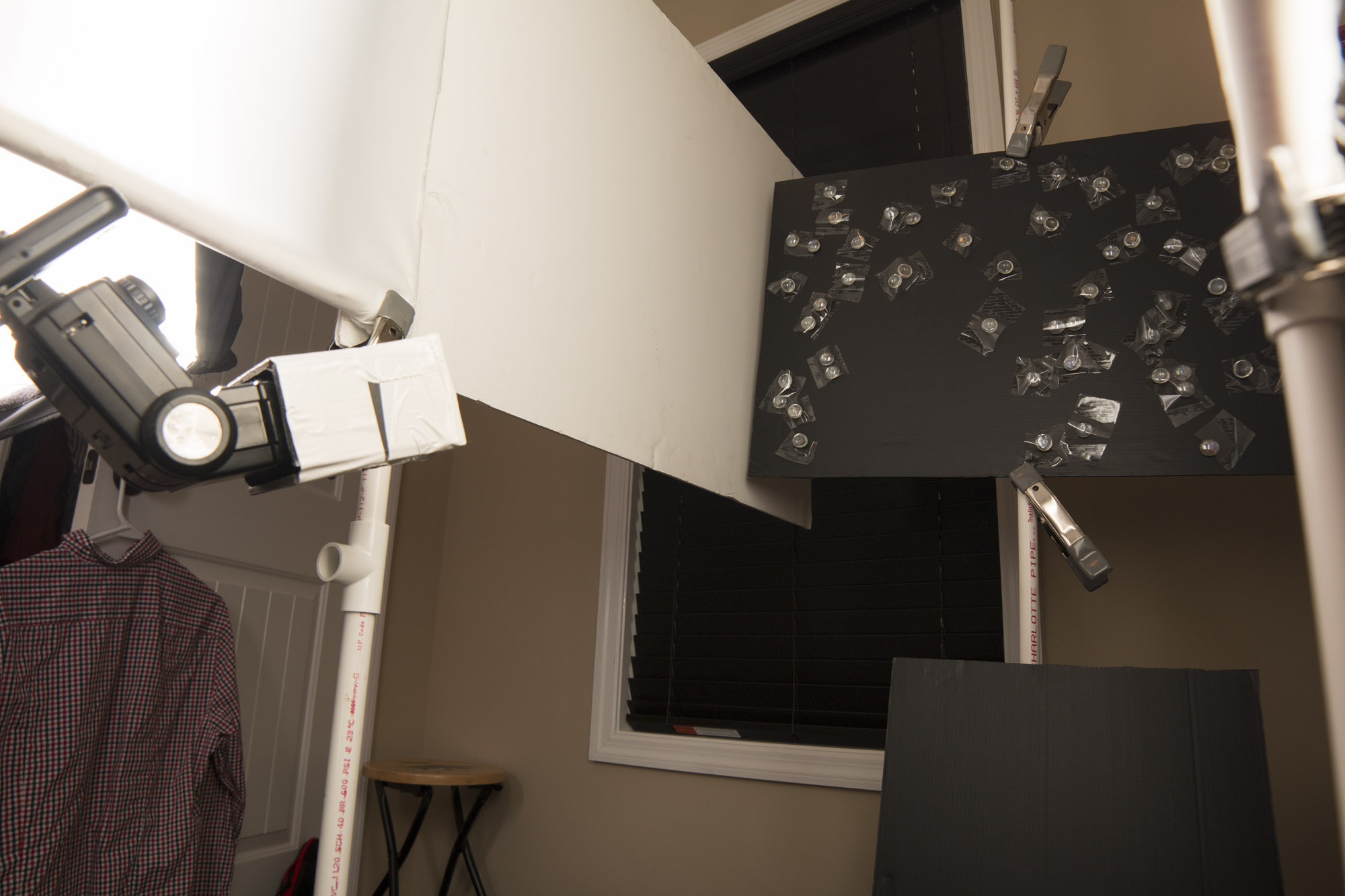
I started my reshoot by setting everything up as I had the day before. I had a light with a grid lighting a background I had made using glass vase marbles. I taped the marbles (this is were I used up all the packing tape) on black card stock as randomly as possible leaving a space at the bottom left for the bottle to be fit into. The light hitting the background reflects through the marbles and back to the camera creating a nice bokeh. And with my table top, black plexiglass, the bottle looks as though it floating in lights.

Next I set up the softboxes. The are modified into thin strips of light with card stock and then defused again through diffusion screens on either side.

The last thing was to fix those anoying black areas. To fix this I put white boards all the way from the background to the light boxes to reflect a little bit of light through that part of the bottle.

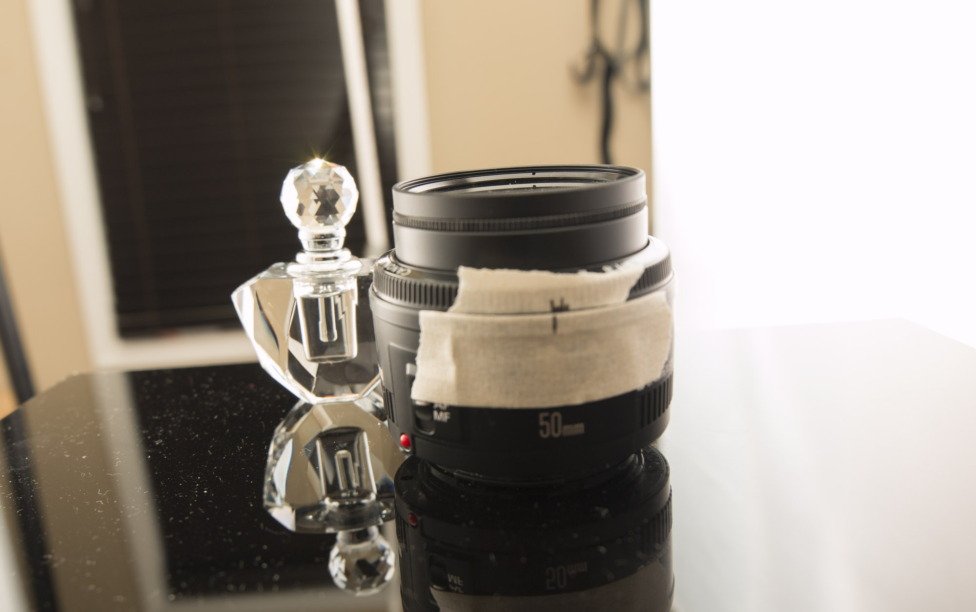
I wanted big bokeh, so I was shooting at a low aperture. So low that the whole bottle was not in focus. To fix this I focus stacked the image. I took five separate images focusing on different part of the bottle then combining the sharp areas in photoshop. Its hard to see the focus on such a small space so I marked my lens using masking tape. The best of both world, a sharp product and great bokeh!

I'm really happy with the final image. I hope you enjoy it too.

Fielder

Yes, I got the yard mowed... at a sprint!

Browning Knife Product Photography

While searching through my house I can find tons of potential products to practice photographing. Most however will be dented, scratched, discolored, stained and in general abused. As such it makes for a bad photograph or at the very least a LOT of work in Photoshop.

So, finding new unused items is beneficial. I decided on a fairly new Browning folding knife I had gotten my fiancé for Christmas for take on future camping trips. (No it was not the only thing I got her... fiancé! ;-)

I had been watching youtube videos on product photography by Alex Koloskov from photigy.com. He often stresses creating a gradient on shinny metal surfaces. So that was my main challenge with the knife.

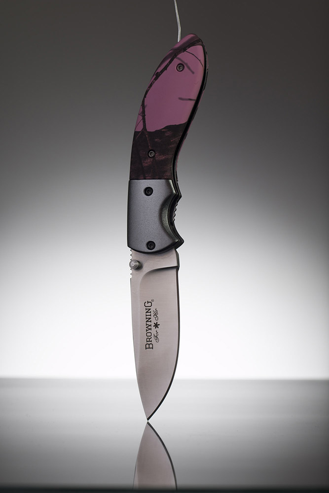
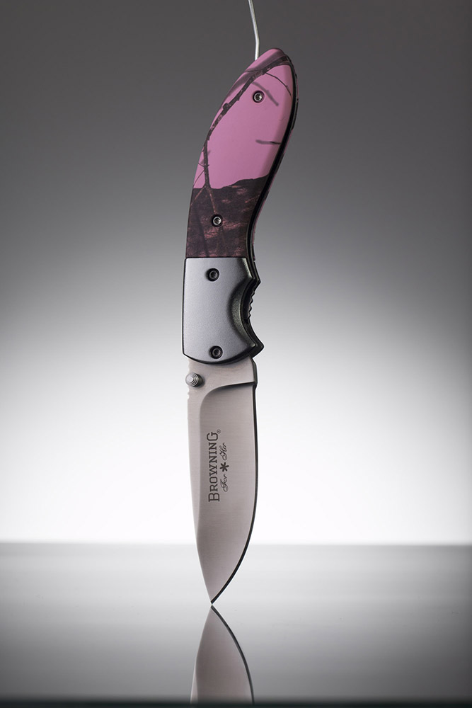
The initial setup was pretty simple. A grid on a light for the background, a strip-box forward and on the left side to light the the front of the knife and another light behind and to the right to rim light that side. The secrete , and what I learned for photigy, was adding a diffusion panel between the left light and the knife. With this I was able to angle it in such a way to create a V. This V could be adjusted wider or narrower and increase or decrease the amount of light drop off that hit the knife.

(The two photos below show the gradient differences. All I did was move the diffuser wider then closer to the light.)

The end result is deceptively simple but looks great!

Final Image

Final Image


Fielder

fspppers workshop with Rob Grimm

So if you don't know in early March I won tuition (worth $3,000) to a product and liquids workshop in the Bahamas with commercial food and product photographer Rob Grimm and the guys at fstoppers.com.

I've been really busy getting thing ready to go this past month. Amongst other things I have been diligently working on my product photography. I have scoured every resource I can find and have learned a lot about lighting and product photography. If you notice all my product photographs have been replace with new ones and with any luck they will be replace again over the next few months.

I've looked up a lot of great resources including RGG EDU, Rob Grimm's educational resource. Also I have watch lot of great videos from photigy.com, run by Alex Koloskov.

I can't thank Rob and the guys at RGG EDU enough for the epic opportunity.

Here is a link to the video were they announced the winners of the workshops.

Enjoy... I know I did!!!

Fielder

https://youtu.be/DM_YQuXi9eI


ChocolatFX

My friend Andrea Smith at ChocolateFX is getting in the swing of Valentine's Day with some awesome specialty chocolates.

I was lucky enough to do the food photography for ChocolateFX's website a few months ago and Andrea had me back this past week to take a few shots for the upcoming holiday.

I had fun hanging out with her in her chocolate factory and store in the Shops of Fatherland here in East Nashville. She has a great blend on artistry and humor mixes to make some delicious treats. My personal favorite is the Ghost Pepper Chocolates.

For this visit, I was taking photos of boxes and molds she will be offering both at her store and online. Check out her hand made chocolates at ChocolateFX.

Fielder

Lighter

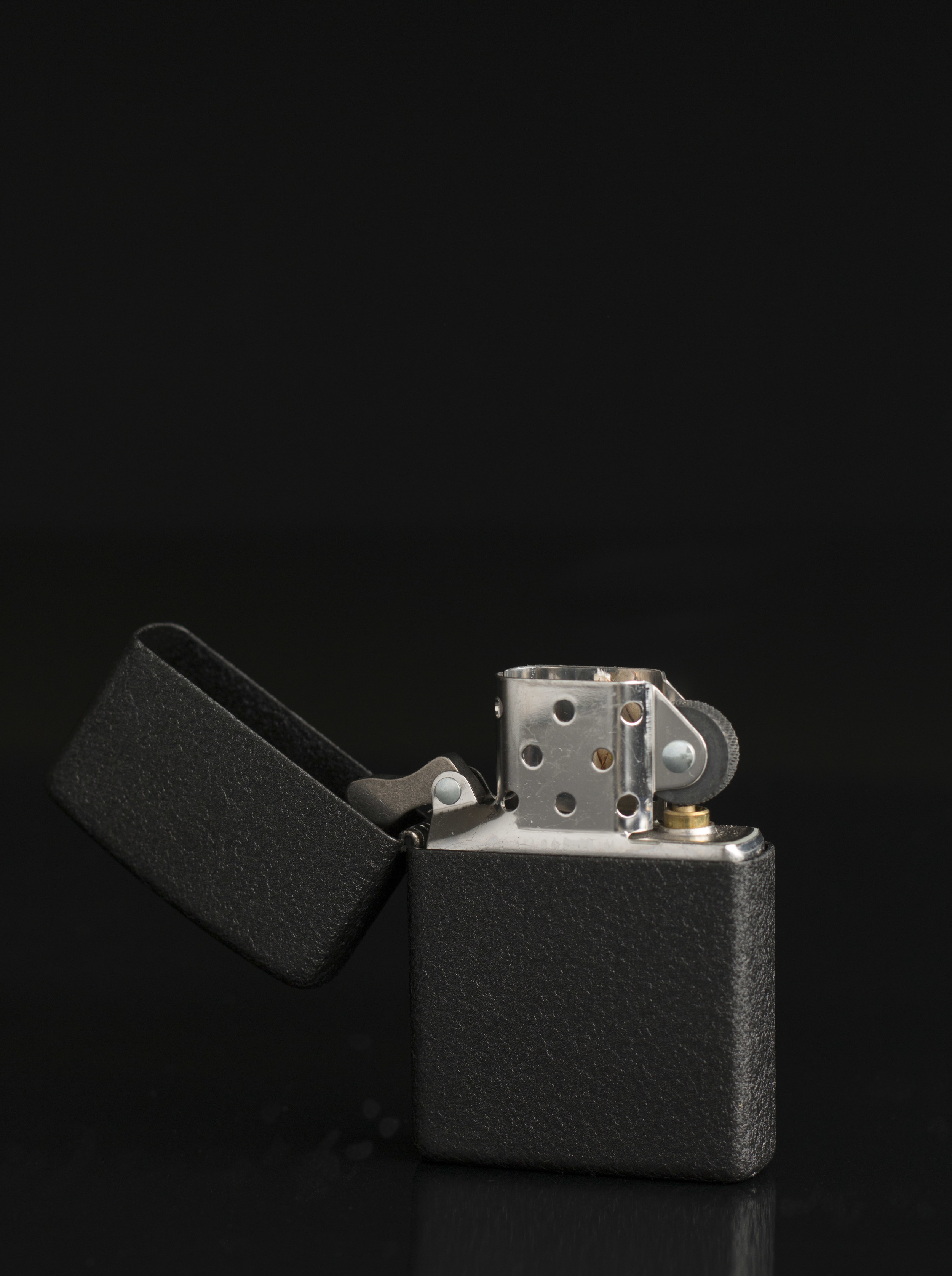
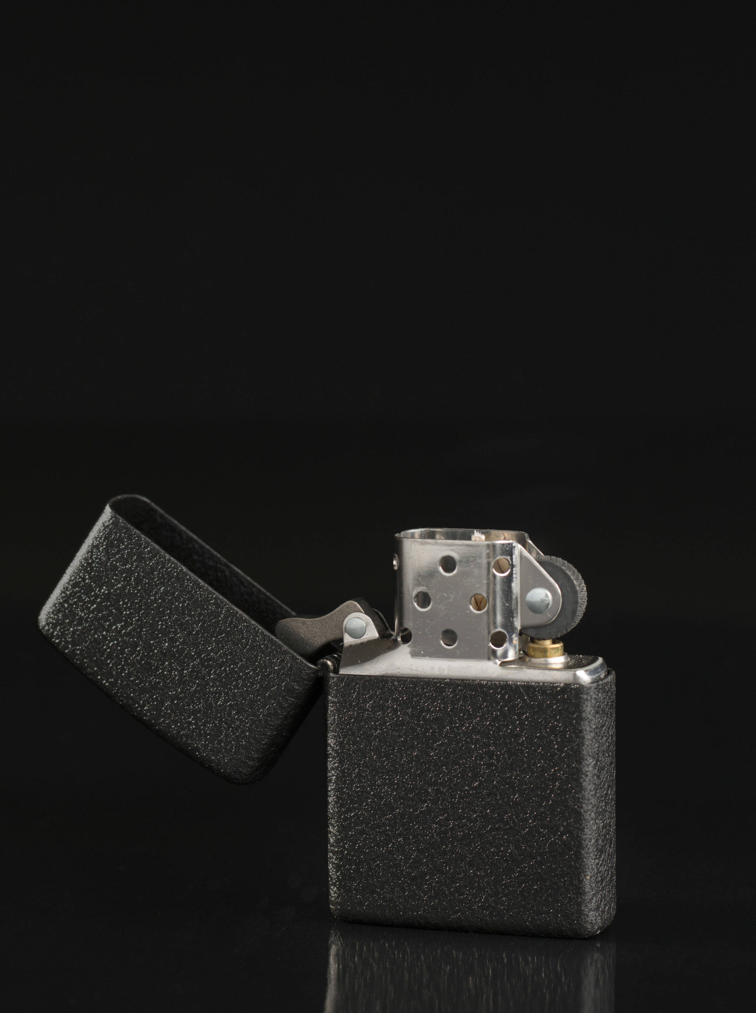
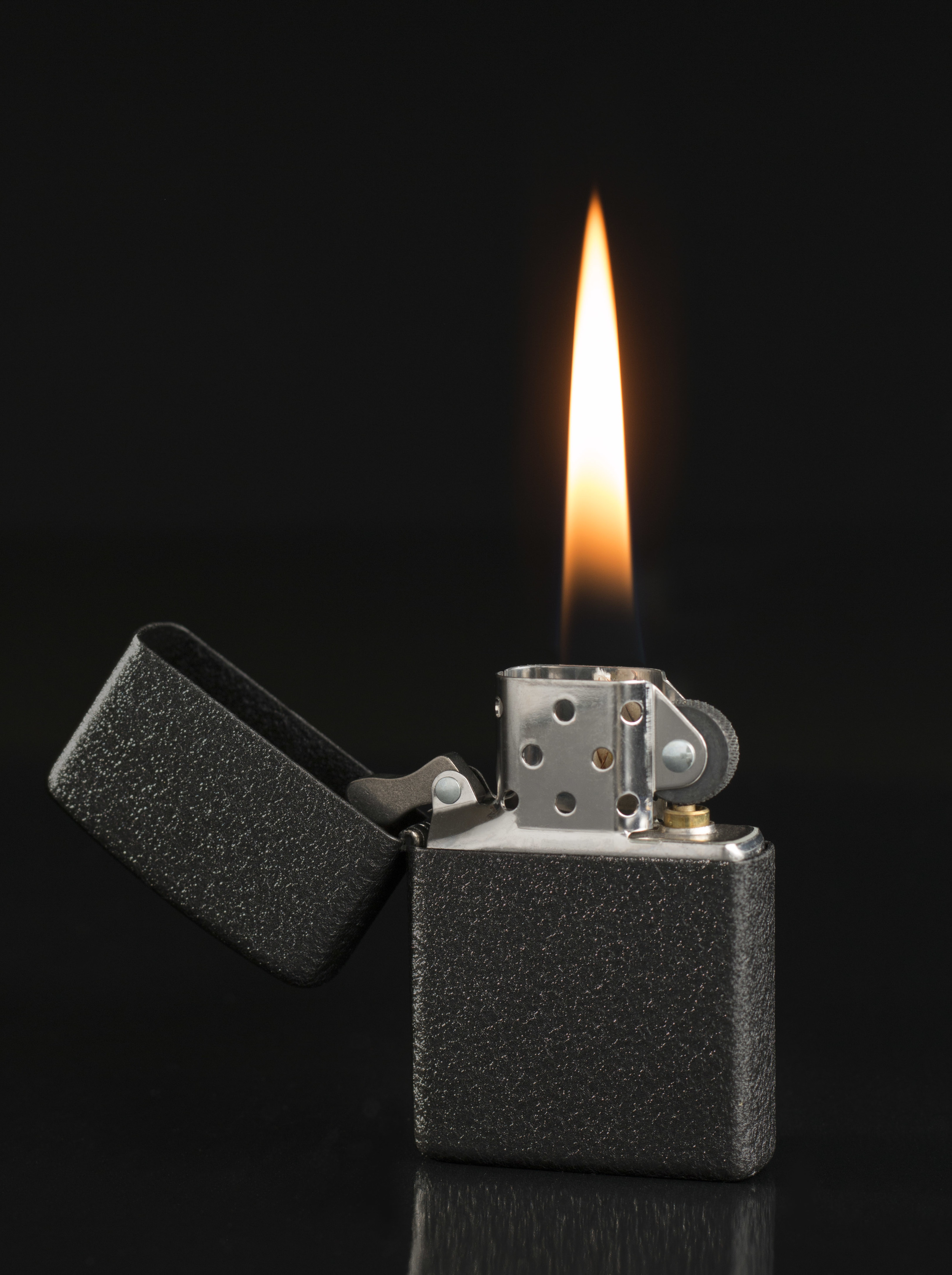
Here is a short post of a black Zippo Lighter on black for product photography. One light to light the over all lighter, the second to show the texture of the lighter, the flame and finally the cleanup in Photoshop (which you may not be able to see at this resolution).
Helle Knife Photo Shoot

With a day off and nothing to do, I decided to put my time to good use working on my product photography. After looking around the house for something that would be fun to photograph I decided on the knife my girlfriend Angela got me a few years ago. The Helle Temagami is the official knife of Les Stroud from the show Survivorman. A great knife and I'm sure it will last generations.


I started by building a little set from stuff found in the back of my East Nashville house. I dug up some moss, found a piece of fire wood with moss growing on it, grabbed a stick and a stone. I put it all together, moved a few leaves around and was happy with the results.

Fielder Williams Strain fiwist product photography helle knife 005.jpg


After placing the knife on set, I put my first light in place, softbox as a back light. I put a fill light directly across from my back light then filled the shadows with two foam-core cards. One was placed directly in front of the camera with a slot cut for the lens and the other to fill a little bit of the shadows in the background.


I liked the over all feel and after changing the knife orientation I went through adding reflective mirrors and flags. I put one mirror to make the logo on the sheath pop a little more and another to add separation between the stump and the background. I added one flags to shade the rock, one for the stick and one to bring the knife handle's brightness down.


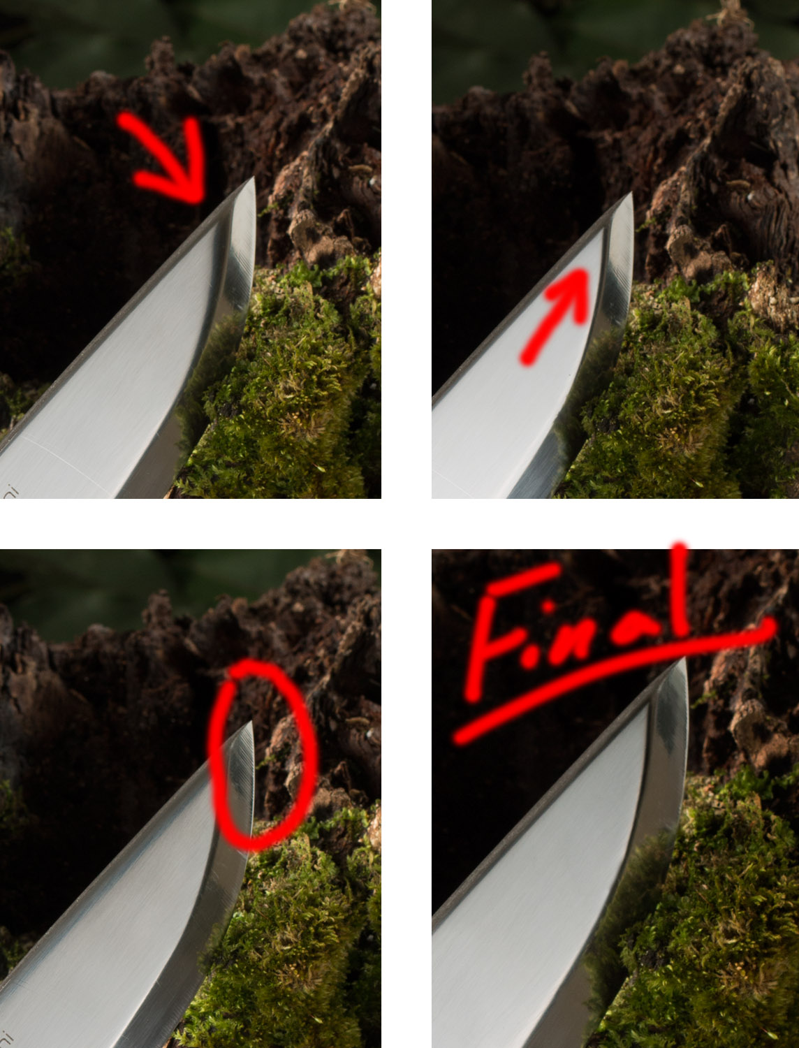
After studying the image a bit I decided I wasn't happy with how the light fell off at the tip of the knife. I spent some time moving my fill light around until I got something I liked. However, I thought I'd need to do a little bit of composite work in Photoshop to get it better. I combined three photos: the first was my favorite overall, the second had a nice sharp transition from the main blade to the knife edge and the last was my favorite for the tip of the knife.


Be sure to check out my other product, food or composite photography.


Fielder

New Website

I'm have began a transition from my old website fiwist.com to my new one fiwistphotography.com. I'm excited about the transition and hope its is a great platform to show off my food photography, product photography, retouching and composite work.

My hope for this blog is to use it as a chance to write about the craft of photography as well as a chance to write about the people and places I am lucky enough to photograph along the way.