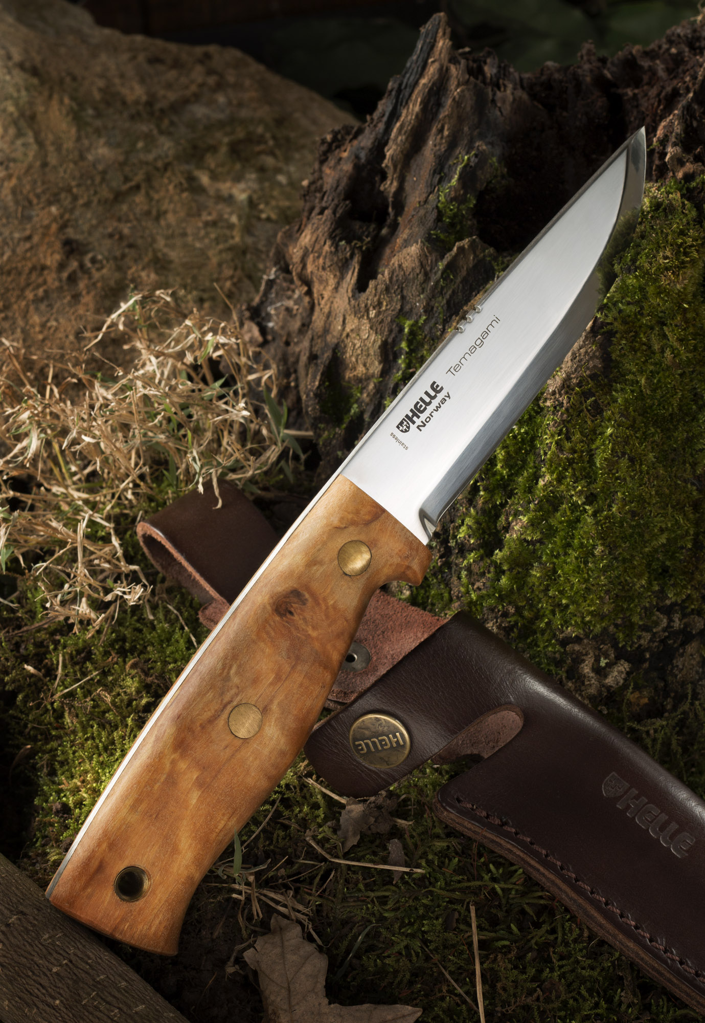
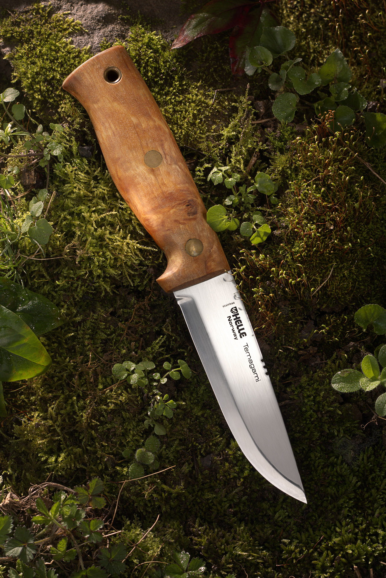
Last year I took a photograph of my Helle Temagami knife. I liked the photo at the time but after a few month I took it off my website because I had better images that I felt represented where my photography was at that time. Since then I've only had a few opportunities to use the knife camping and have only manages to put a few more scratches on it.
I decided to use it for this weeks project and apply a lot of the things I've learned over the last year. Similar to the original, I really wanted to make an outdoor feel in the studio. I built a little set with moss, rocks and leaves from my back yard. The big difference was how I applied the lighting techniques I learned over the last year. I used a low back light to act like early morning sun coming through trees. Also, I really spent time and care lighting the blade of the knife to create the gradients near the logo and along the edge of the blade.
Although the ideas behind both pictures are the same I think there is a huge difference in the quality and execution of the two images.


