• Bottles
  • Beverage
  • Boots
  • Accessories
  • E-Comm
  • Architecture
  • About/Contact
  • Blog
  • Menu

FIWISTphotography

  • Bottles
  • Beverage
  • Boots
  • Accessories
  • E-Comm
  • Architecture
  • About/Contact
  • Blog

Week 17

May 21, 2016

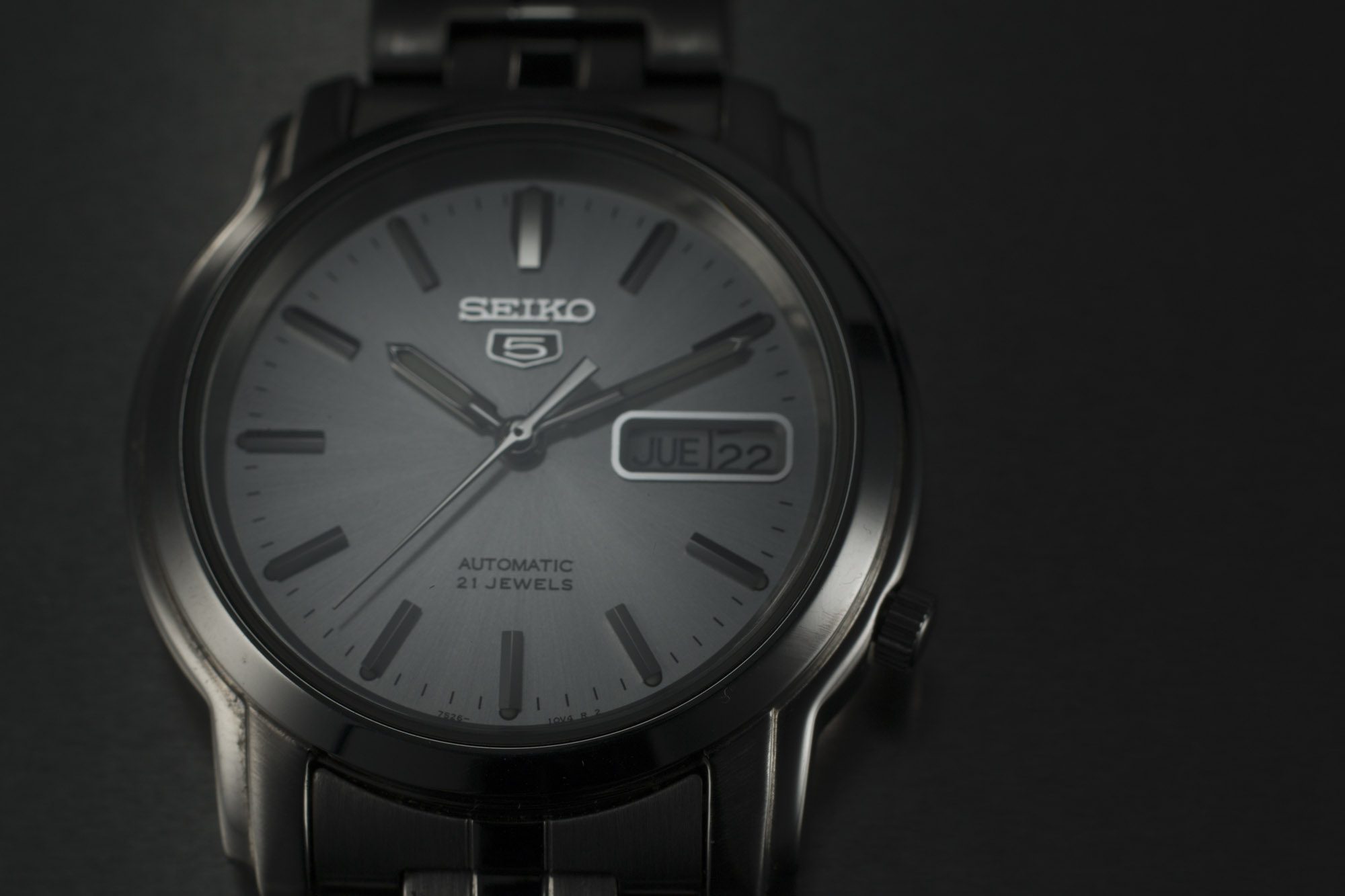
I love the challenge of shiny silver products. With shinny watches I have to be able to creating gradients but still have black areas so it doesn't look mat gray. Also, I have to light the watch in a way that is bright in the areas I want but drops to shadow in less than an inch. Moving a light even a fraction of an inch can make a huge difference. But it becomes a fun puzzle adding one light, then another, then another until I get them all exactly where I want. Then if needed I can add black cards to darken areas that need to become darker quicker or to add contrast.

I wanted to make this shot look as though the watch had just dropped into water, but if I just drop the watch into water it would look pretty terrible.

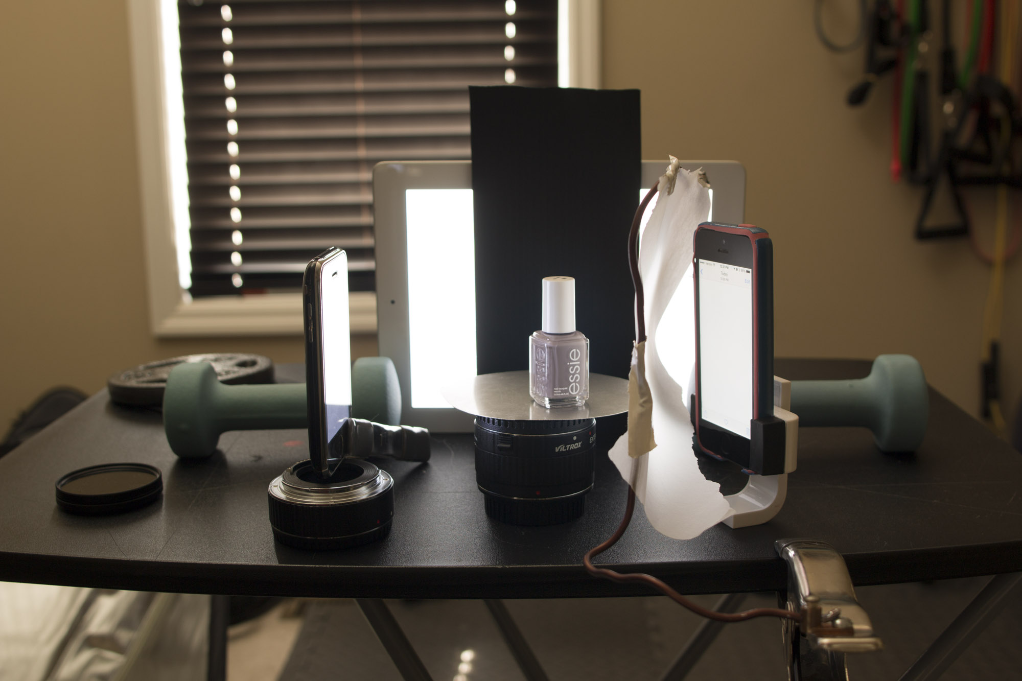
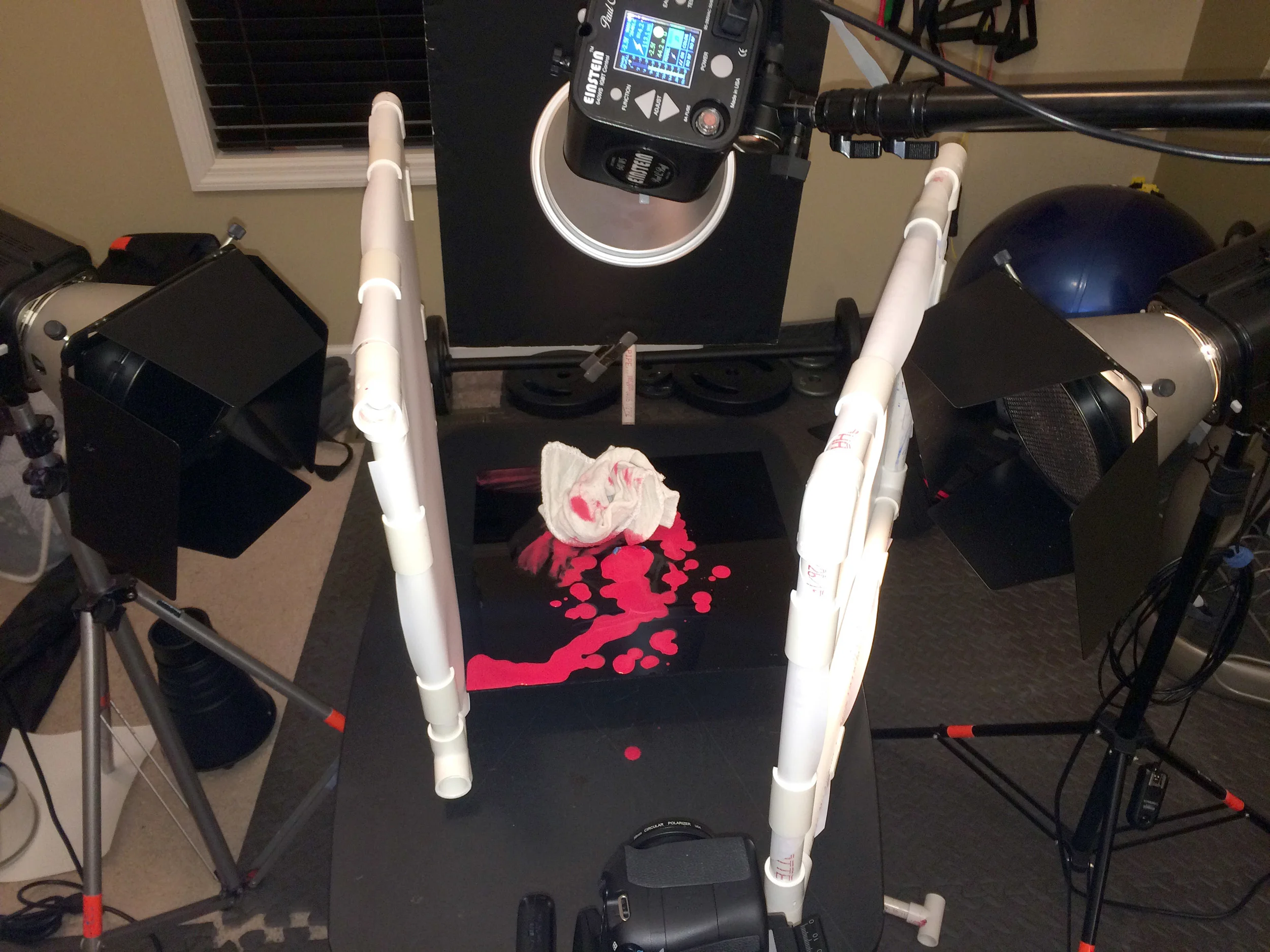
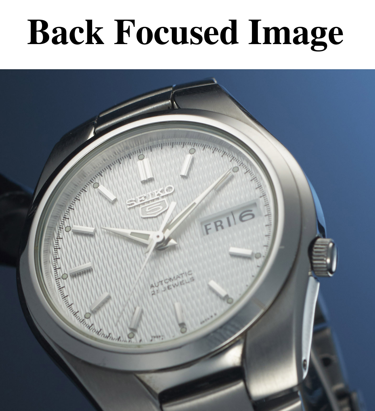
I knew I would being doing a composite. I wanted the watch to look its best so I shot it first by itself using a diffusion cone. After mounting the watch to a light stand, setting up the gear, adjusting the lights, two diffusion panels and diffusion cone I was ready to shoot the final image of the watch. The total time to this point was approximately five hours.

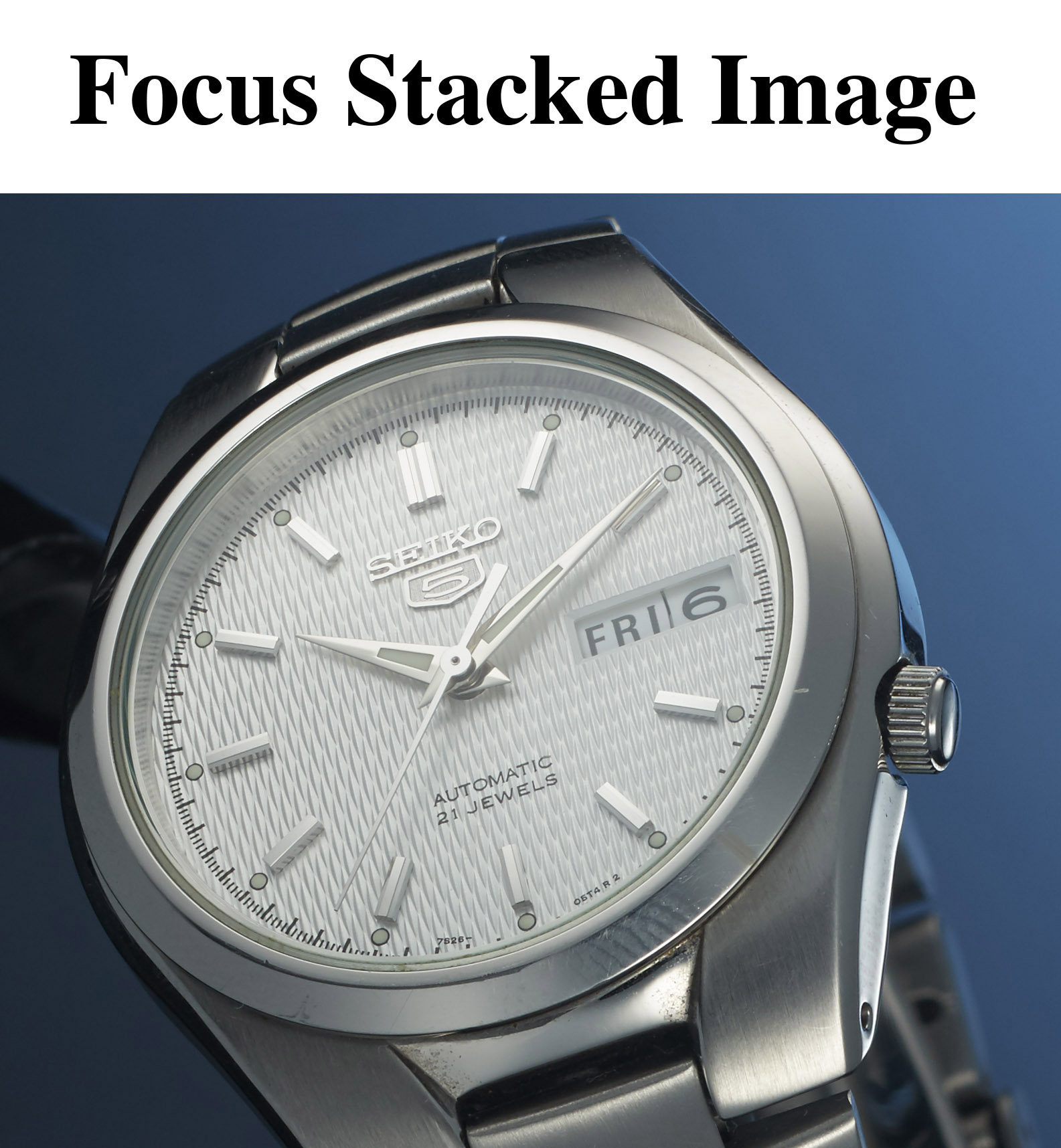
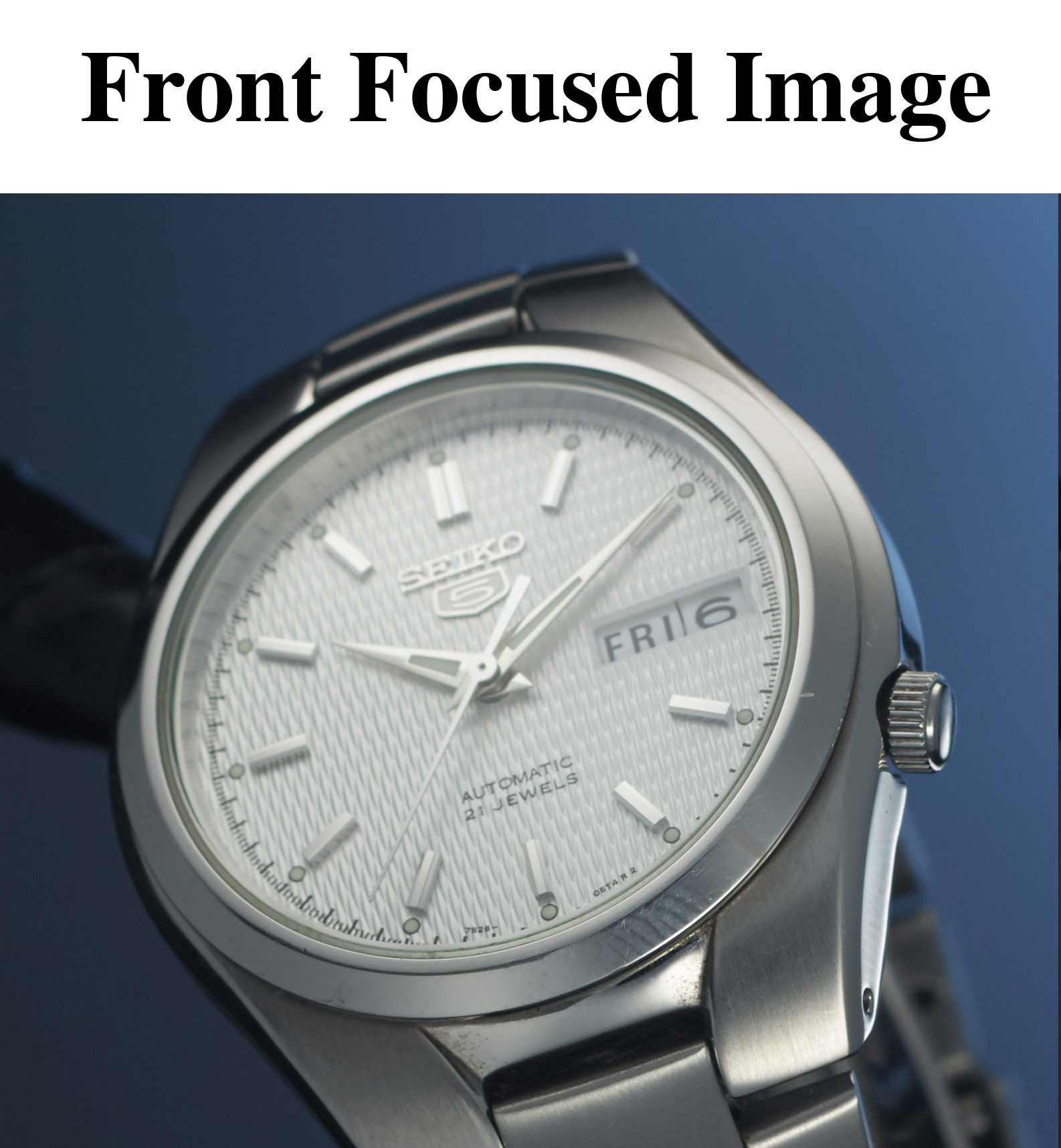
I had such a shallow depth of field I needed to focus stack the image. Focus stacking is the process of taking the same image several times and only changing the focusing point so that each image can be combined into one image. The final image has the entire product totally in focus. I took seven images and focus stacked them together to insure the face of the watch and most of the band would be in focus. Photoshop has a focus stacking option but after trial and error I have found Helicon Focus to be much better application.

Focus Stack 001a.jpg
Focus Stack 001b.jpg
Focus Stack 001c.jpg

At this point in the photo I had to stop for the day and continued the water and splash photography the next day when I had more time and less distractions. I left the set as is was. The next day I decided to recompose with more room above the watch and take another series of focus stacked images.

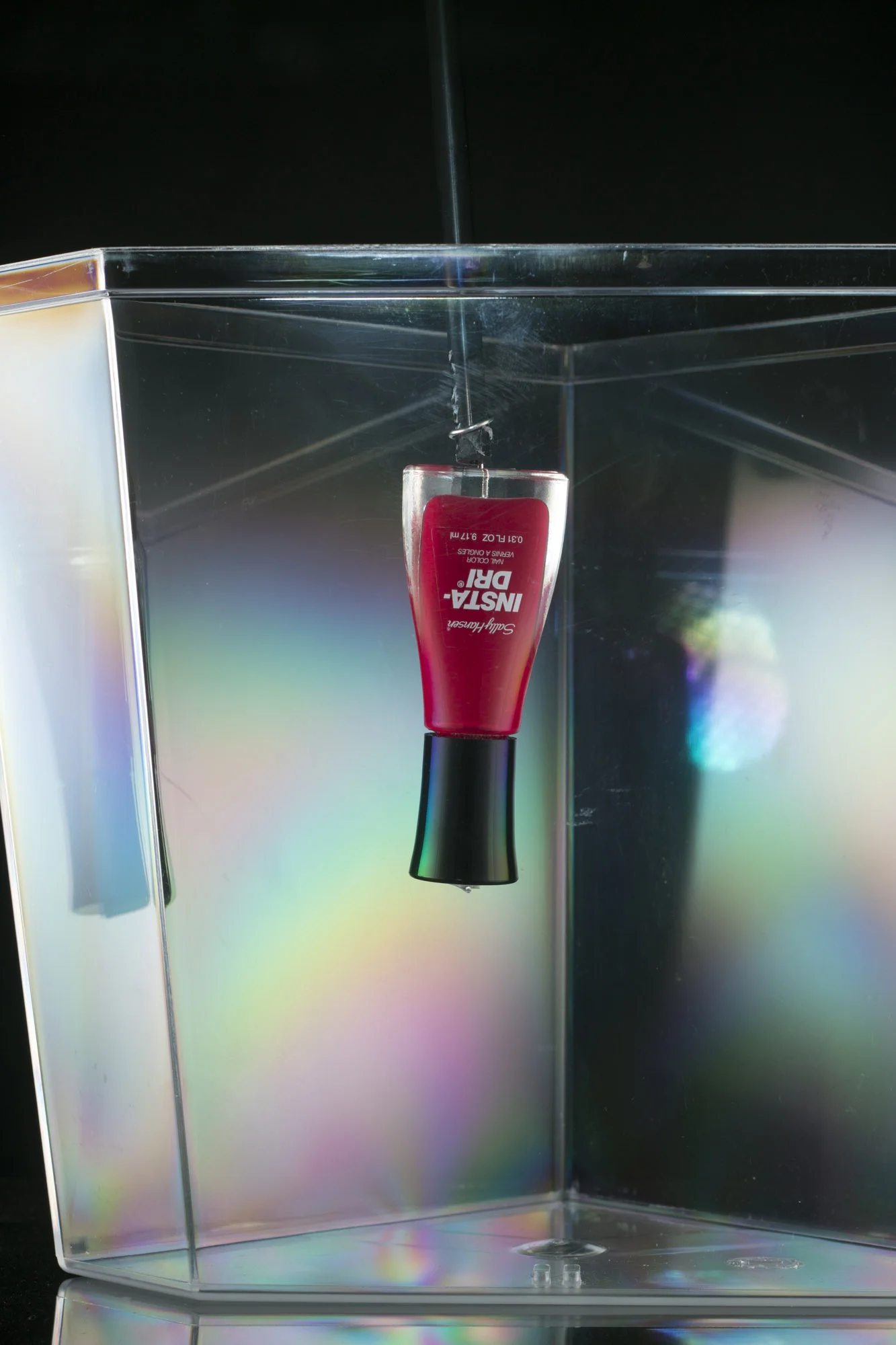
Retaking the photo didn't take too long and I quickly moved on to the water portion of the picture. I started by placing a 1.5 gallon fish tank on set, trying my best not to move the watch, and then filled it with water. With the watch submerged I then used a piece of small tubing to blow bubbles in the tank under the watch and took pictures until I ran out of breath. The bubbles looked great but were mostly too big. After several attempts I came up with the idea of taping a piece of paper towel over the tube. This worked great and made the bubbles a lot smaller. After getting lots of variety of smaller bubbles I then switched to splashes.

I had to remove the diffusion cone to smoothly drop the watch into the tank but I left it attached to the light stand so that it would stay in a similar position to the original shot. I shot dozens of variations of the drop.

In the final image I composited together 14 individual images including the final focus stacked image of the watch, several large and small bubble pictures and two of the splash pictures. It took the better part of a day to composite, retouch and color correct the final image.

Comment

Week 16

May 09, 2016

I have been working on my architecture photography pretty heavily the last month. As well as contacting a local home builder about taking photographs I also contacted Nashville architect, Steve Durden, about taking photos of some of his work.

I told Steve I really wanted to take another twilight photograph. We ended up taking photos at of a house he recently remodeled, turning the ranch style house into a beautiful two story home with an epic front window.

I got to the house a little early and took a relatively quick photo of the screened-in porch in the back as the sun set. The end result is a little flat because of my fill flash but I liked the overall feel of the image.

I spent a bit of time deciding on the composition and really liked the house framed by the large tree in the yard. The final image is a composite of several ambient shots and several shots where I used a small flash to light sections of the house.

Comment

Week 15

May 04, 2016

One would assume I have an obsession with knives considering all the photos I've taken of them for my product photography portfolio and maybe that's true but I really do enjoy photographing them. I like that they have both a shinny silver surface and a textured handle that each have their own lighting requirements. I like that they can be placed in various scenes from simple black and white backgrounds, to kitchen counter tops or even elaborates outdoor sets.

This week I took a photo of my Kissing Cranes knife. It was a really simple setup with a back light to create texture on the wood shooting surface and handle and two lights with diffusion panels on either side. One to act as a fill light and the other to create the gradient on the blade.

The table top surface was a sample tile from the hardware stores flooring section.

1 Comment

Weeks 12, 13 and 14 of 52

April 20, 2016

One of my goals when I started this year long project was to work on my architecture photography as well as my product photography. The last three week I have photographed two model homes built by Dalamar Homes. I had taken some head shot for this family owned company a few months ago and got in touch with them about taking photographs for my project.

I started by photographing their Natchez Pointe model home just south of Nashville. It is a really nice place with large rooms and is wonderfully decorated. I consider myself lucky t be able to practice my architecture photography in such a beautiful home.

I shot the upstairs rec-room, master bathroom, master bedroom, kitchen and living room. I posted all the photographs to a few architecture Facebook groups and got some great feedback. The biggest things they said was about the photographs was that some were little heavy handed with the flash. Also, they had a few composition concerns with the rec-room and kitchen photographs.

I had intended on shooting a twilight exterior of the same home but was not able to because of a rain storm.

For the second week I photographed at the Hendersonville model home. Also, a great space! I really wanted to work with the existing window light and try to fill in the shadows with my flash. To make a more natural look to the lighting. Also, the house was so well decorated I began shooting a lot of the decorations as interior design style shots. I felt I was really able to balance the ambient light and fill flash better this time. I tried to have the available ambient light appear to be the key light and fill in shadows my flash. This made for some great natural looking lighting.

For the Hendersonville house I was able to get an exterior twilight. I photographed the exterior for about an hour and a half bracketing shots as well as using a flash unit on a pole.

I think the final image was a great first attempt but the criticism I got from my Facebook groups was that the flash was over bearing, non-directional and unnatural looking. I agree with that assessment and I hope I will be able to shoot another twilight soon and use their advice to improve.

For the third week I went back to the Natchez Pointe model to take another exterior twilight. I tried to listen to the suggestions made about the first exterior. I lowered the flash power and tried to blend the ambient and flash a little better. I think there is a lot of room for improvement with my exterior shots, but the I feel like the interior shots are coming together nicely so far.

Comment

Weel 11 of 52

April 10, 2016

For this weeks project photo I tried to diverge from my product photography theme and photograph coffee. I wanted to make a sunrise coffee shot with the coffee cup, beans and an old hand grinder. I had pre-visualized the lighting and it nearly matched what I had in mind but honestly I wasn't feeling it.

Stylistically it's not what I have been working on. I really enjoy when I can incorporate clean lighting and gradients on glass and shinny objects. I was not able to do that effectively for this shot and i didn't like the direction I was heading.

In the end I realized whatever photograph I ended up with it would not fit in with my current portfolio of images. I spent a few hours playing with lighting and learning what I could from this shoot but decided I would return to this theme later when I had a more cohesive idea of the end result.

Comment

Week 10 of 52

March 23, 2016

Last year I took a photograph of my Helle Temagami knife. I liked the photo at the time but after a few month I took it off my website because I had better images that I felt represented where my photography was at that time. Since then I've only had a few opportunities to use the knife camping and have only manages to put a few more scratches on it.

Fielder Williams Strain fiwist Product Photography nashville 002.jpg Fielder Williams Strain fiwist Nashville Product Photographer Helle temagami knife .jpg

I decided to use it for this weeks project and apply a lot of the things I've learned over the last year. Similar to the original, I really wanted to make an outdoor feel in the studio. I built a little set with moss, rocks and leaves from my back yard. The big difference was how I applied the lighting techniques I learned over the last year. I used a low back light to act like early morning sun coming through trees. Also, I really spent time and care lighting the blade of the knife to create the gradients near the logo and along the edge of the blade.

Although the ideas behind both pictures are the same I think there is a huge difference in the quality and execution of the two images.


Comment

DIY Flexable Photography Clamp

March 14, 2016

I saw one of these flexible wire clamps online a few years ago and built my own shortly after. Since then I've used these a lot during my product photography from holding small light modifiers to suspending the product itself.

The equipment list:

1 A-clamp (I always buy ones that have a neutral color handle to avoid color cast.)

1 Alligator clip

1 Terminal Lug (Right next to the Alligator clips in Home Depot.)

1 Screw with nut and locking washer (a 3/8 inch screw worked for the thickness of my lug and clamp)

Wire (I used a foot in length of 4mm aluminum wire that is coated with copper.  Copper 4mm wire will be VERY hard to bend. You will most likely want to get a thinner wire but use your best judgment.)

Pliers

A Drill

First take off one of the rubber handle on the A-clamp and drill a hole wide enough for the 3/8 inch screw to fit through. I started with a small drill bit and worked my way to the size I needed.

Attach the terminal lug using the screw, locking washer and nut.

Now time to modify the alligator clip. You will need to remove the strip of metal in the hole below the screw so you can thread the wire though. I used wire clippers to cut the metal strip off then the drill to clear the hole so the wire slid through cleanly. Next use some pliers to bend open the channel on the back of the clip that the wire will run through.

IMG_4006.jpg IMG_4007.jpg IMG_4005.jpg

I flatten the end of the wire that I attaches to the clip and then drill a hole that is big enough for the alligator clips attachment screw. In the past I have used a hammer to flatten out the wire but this time I used pliers to crush the tip. (The hammering was easier.) Also, I've made several of these and only managed to drill a perfect hole once. What I usually end up with is a U shape on the end but that will hold fine.

After I get my flattened U or hole on one end I bend a 90 degree angle in the tip of the wire. Next I thread the other side all the way through the hole. I attach the screw and then bend the wire again through the open channel creating a Z shape to the wire. Lastly I close the channel tight around the wire.

IMG_4013.jpg IMG_4020.jpg

Finally, I attach the other side to the terminal lug on the A-clamp.

I while back I found a large flexible makeup mirror at a thrift store and used it to make a heftier set of flexible clamps. The only difference in assembly was larger terminal lugs.


Comment

Week 9 of 52

March 14, 2016

If you spend enough time with enough photographers you will find it impossible to get away from the question of gear. I'm not a gear-head but I've been asked my fair share of, “what do you shoot with” or even worse, “what were your camera settings?”

To me these types of questions are irrelevant. I shoot the subject with the equipment I had on hand and with the settings I that believed were best at the time. If I need to reproduce the shot later I will definitely write down all the settings and even measure the height of things, but this is for consistency and speed.

When I started shooting studio products I had one 20 year old White Lightning, a Canon flash and a Vivatar 285. A while back when I bought my Einstein lights I was very excited. They have saved me a lot of time and effort getting the light the way I want it to look. But even though the Einstein's are a huge upgrade they have their limitations. As a photographer, no matter what equipment I use, I have to be adaptable and work with any and all limitations.

This week I decided to see if I could light something using my iPad and 2 iPhones. These “lights” had limitations for sure. The older iPhone was dimmer and bluer than my newer one and I didn't have stands to hold two of them but I made due. The depth of field was extremely shallow and I could have done a focus stack but considering the lighthearted nature of this project I decided not to. I used wax paper on the right side for diffusion.

Comment

How-to Build a PVC Diffusion Panel for Photography

March 04, 2016

I've had several people on Facebook ask about my DIY equipment. I am almost to the point were financially I can start replacing some of my homemade stuff but honestly some things like my diffusion panels work so well it's not a high priority. I imagine there will come a day where the branding of my company will supersede the inexpensive and functionality of my DIY gear. However, I think being bit of a MacGyver will always be part of my photographic charm.

I'd like to do a little How-To on building a PVC diffusion panel.

Equipment list: PCV Cutter: 1/2 inch PVC pipe, 3/4 inch PVC pipe (One size larger that that used for the frame), 2 “T” shaped PVC connectors, 1 “L” shaped PVC connector, 1 “X” shaped PVC connector (All connector for 1/2 inch PVC), Heavy Savage Plastic (I was using a $10 shower curtain as my diffusion material. It worked fine but Savage plastic has several advantages.)

The PVC cutter is key. It reduces the construction time down to a matter of minutes. Also, the larger width PVC is for attaching the diffusion material to the frame. For the example build you will need a total of 16 inches of 3/4 inch PVC. If you want to make legs for your panels you will need more of the 1/2 inch PVC and 6 more “T” shaped connectors. For this example I made a 1 foot by 1.5 foot panel.

I started by cutting two 1 foot and two 1.5 foot sections of 1/2 inch PVC. (“Measure twice, cut once.”)

Use the connectors to assemble the pieces together with the “X” between the two “T” connectors. If you use legs like I do this allows you to use the panels horizontally or vertically.

I've never bothered gluing the frame together. If you push down hard enough it will not fall apart and I always like they idea that I could break them down if I wanted.

Also, I try to face the red lettering out so there is little chance that I will see it reflected in shinny objects.

Next you will need a total of 8 pieces of the 3/4 inch PVC cut into 2 inch lengths. (If you are making panels that are wider you can cut enough for three fasteners on each side)

You want to cut a more than a quarter but less than half of the fastener off. The remainder should easily snap over the Savage plastic and the frame tightly holding the plastic in place. However, if you cut too little off the fastener it will be nearly impossible to attach to the frame and if you cut too much it will not hold.

Here is how I did it: On my cutters there are two metal pieces that hold the PVC opposite the blade. I stick the holders inside the end on the 2 inch piece and cut length wise. The holders side makes two indentations on the end of the PVC opposite the cut. These marks are perfect indicators for where to make the next cut.

20160305_how_to_diffusion_panel_0019826.jpg 20160305_how_to_diffusion_panel_0019833.jpg 20160305_how_to_diffusion_panel_0019846.jpg

When I make my next cut I always try to cut off all of the red lettering on the outside of the PVC. Because the 2 inch piece is too long to cut through in one cut I have to make four separate cuts. Repeat this process until you have all 8 fasteners.

Next, I lay my frame on top of the Savage plastic. I use a spare PVC to add width to the plastic so I can have some extra length to wrap around the frame. I make little tick marks with an Exacto knife. I don't use a pen because I'm trying to avoid putting black marks on any of the diffusion material.

Using a straight edge I cut the Savage plastic to size.

Next I lay the frame back over top of the plastic. I use a Exacto knife to make two marks where the PVC connectors meet the 1/2 inch PVC pipe. Then I cut out the area to go around the connectors at an angle.

20160305_how_to_diffusion_panel_0019865.jpg 20160305_how_to_diffusion_panel_0019867.jpg 20160305_how_to_diffusion_panel_0019876.jpg

Finally, I wrap the extra Savage plastic around and connect it with two fasteners on each side. If it is a little loose I twist the fasteners a little to tighten everything up.

I have two different size diffusion panels, the 1x1.5 foot panels and 2x3 foot panels. I use interchangeable legs and feet for both sets of panels. I will not go into detail on how I make the legs because they are pretty straight forward. I have three different leg lengths that I mark with different color tape so I can pair them up at a glance.

I hope this is helpful to you. Thanks for reading!

1 Comment

Week 8 of 52

March 04, 2016

I picked this weeks subject because I wanted to try the paint cloud photograph I had tried a week ago. I purchased a much smaller plastic fish tank for this, but I ran into two problems. The tank was somewhat triangular in shape which had terrible reflections and if that wasn't enough the plastic refracted the light into a rainbow of colors. Either one of these problems made the tank unusable for my purposes so I decide I would need to get a third smaller glass tank for the cloud project.

By the time I had figured out these limitations I had already spent two hours minutely adjusting the light on the bottle. I really liked the way it looked and because of this felt I could make a great tabletop photograph. The only problem was the bottle was suspended upside down ready to be submerged in water.

Fortunately the lighting was very symmetrical so I was able to flip the nail polish right side up and place it on a Plexiglas surface with only a minimal amount of readjustment to the lights. I added the background light and thought I had a really nice simple image, but as with most things I wanted to make it more interesting.

I thought about adding drops of paint, which I had available for the cloud effect I was originally trying to create. Since I had a nice image already, if I managed to ruin everything with paint it didn't matter.

I've had a few moments in this photo project where I had a nicely lit image but I wanted to add something to make it more visually appealing. The whisky splash photo from a few weeks ago is one example. I already had a solid image I just tried to add something dynamic. I believe starting with great lighting was key in both instances.

Comment

Weeks 6 and 7

February 28, 2016

The last two weeks, week 6 and 7 of my project, have been busy and very productive.

I have all but finished my work for Southern Polished, a local store in Brentwood, TN that shines and repairs shoes. They also sell their own hand made leather sandals and flip flops in which I took catalog photographs for their website. All told they will receive around 168 catalog photographs.

While I had the sandals I decided to make a few extra photographs and call these one of my self-assignments.

This week I wanted to try something special.

I bought a fish tank and tried to make a photo of nail polish with a cloud of color behind it. This project was less than successful. I bought a fish tank far too large for the project. I had to carry it to and from the bathroom to replace the water after each shot which was cumbersome and a little dangerous. Second, the cloud of color changed the lighting requirements as it got bigger and bigger. Overall it was a very interesting test run but I did not end up with anything I thought was worth retouching in Photoshop. I know that I'll be trying to do this project again soon.

My business has been off to a great start this year and I have a lot of upcoming assignments. However, I know this means I will continue to struggle to balance all my work with this personal project. I'm still hopeful and have a several ideas I am anxious to try.

Comment

Week 5 of 52

February 07, 2016

For this weeks product photograph I really wanted to take another photograph of a bottle. I like taking photos of glass, it always has its challenges and the results can be very dramatic and/or beautiful. I picked up a four pack of Izze Sparkling Blackberry water at the store and then selected the two best bottles.

The lighting and composition was intended to be a “beauty” shot of the bottle. I forgot to take a set up photograph before breaking down the set, but the lighting was not too complex, although it did take a while to get the lights exactly where I wanted them to be.

I started by surrounding the bottle on three sides with diffusion panels. I used a 20 degree grid on the light behind the bottle and barn door modifiers on the two sides to create a nice gradient on the edges of the bottle. The light on the front label was a reflector with a grid and polarizing gel. Combining the gel on the light and the polarizing filter on my camera I was able to cross polarize the light on the front to remove any ugly glare.

Once I was happy with the light I prepped the “hero” bottle by adding the fake ice with a small paintbrush. Then I sprayed the bottle with a mixture of glycerin and water to act as condensation.

 It took a few hours to photograph and a few more to retouch but overall I think I was able to produce a nice image.

Comment

Week 4 of 52

February 01, 2016

Week number four of my year long project was a busy one. On top of my regular work week I was also working on website catalog images for a local company called Southern Polished. They are a shoe repair company that also hand crafts sandals and flip flops. I knew I would be short of time so I wanted to make this weeks project fairly simple, but it evolved into a heavily composited splash photograph.

I started out with the idea of photographing a simple Jack Daniel's whiskey photograph using some fake ice cubes I had gotten. One light was behind a diffusion panel with a board in the center. This created a very sharp rim light on the sides of the glass. Light two was used to light the red textured background paper. The final light was a gridded snoot light directly above the glass.

The set up was straight forward and I was able to get an image I liked within a few minutes. I spent a little time moving things around to see if I could improve on the picture. Then as a fluke I decided to take the ice cubes out and drop one into the glass. I immediately liked the splash and switched all my lights to the “action” mode so the I could stop the droplets in mid air.

I love the final image, but there were two thing I could improve upon next time. My exposure was within tolerable limits but it was too low. Not something I'm proud to admit but it happened. Also, I should have done a ruff composite before I stopped shooting. I shot lots of images to give myself options but I only had a general idea of what the final image would look like. A ruff composite would have helped solidified what direction I wanted the splashes to go and made the final image even better.

1 Comment

Week 3 of 52

January 26, 2016

After week two my optimism was really high, but the realities of life came crashing down upon me in week three. I had a lot going on in my personal and business life. I a had a good meeting with a new client, but I also had two family members have accidents that sent them to the hospital. (They are both recovering fine.)

This week's photo is of a Seiko watch. My goal was to shoot the watch straight on using a diffusing cone. As the photograph evolved it turned into more of a light test and although I like the final image I think I can do a little better if I spend more time practicing. (Luckily I have 49 weeks to go in my challenge.)

I used four lights for this shot. My three Einstein strobes and a small flash unit. I have another large strobe but the color temperature is slightly warmer (more yellow/red) than the Einsteins. With the product being a shiny silver watch the difference in color would be glaring and potentially a lot of work to correct. The small flash, although a little more difficult to work with, has a matching color temperature.

The problems I ran into have a lot to do with the lens used. I had a 50mm lens with a macro tube. The quality of the lens is fine for most of my purposes. The problems are because of how close the camera has to be to the subject. Because of the distance from my camera to the subject everything else was affected. The cone I had to use was smaller and because of cone size the lights have to be placed closer. This affects the fall off of the light and the amount and quality of gradation I'm able to get on the polished surface of the watch. My ability to move and organize the lights around the cone is also affected. (I apologize because I changed to using diffusion panels before I took a set up photograph.)

I played around with my lighting set up for a while and eventually got a photograph I liked. I then decided to switch to diffusion panels. My goal was to see if I could give myself more room and create smoother gradients that went to black.

When shooting with a cone the light bounces around inside. This lights the parts of a shiny object not directly lit by the strobes. With a small cone like I was using there is not enough room for the light to drop off completely. The panels however allowed the light to drop off to black but there was not enough coverage around the watch to light the areas not directly hit by light.

Again, I don't dislike my final image here but I think it is important to recognize limitations and find ways to improve in the future. That is what this project is all about.


Comment

Week 2 of 52

January 17, 2016

I know I've only made it two weeks into this year long project to shoot a self assignment every week but I feel like I'm moving along well. I'm sure I'll hit some roadblocks but so far I'm still excited!

This weeks product photograph was a black Docker dress shoe. I've taken photographs of shoes before but this one was more about lighting it in a dramatic way. I don't want to take credit for the lighting set up which came from a video on Broncolor's Youtube channel. I did however make a few modifications to meet the needs on this particular shoe and my equipment.

The photograph took several hours to complete, and in the process I worked out several problems and learned a great deal. The thing I learned most was the importance of using specular lights with only grids, snoots, and barn doors. It allowed the shoe to have tons of texture and really makes for a dramatic look. I did use one soft box to rim light the back of the shoe, but even that had a grid to reduce and control the light better.

I added two white cards to put a rim light on the toe and heel of the shoe. I also added a black card to shield the heel from the main key light.

The one thing that I feel needs the most improvement is the background. I described it to one person on Facebook as being “a little too early 90s for me.” In the future I hope to execute that better. While doing the post processing work in Photoshop I blurred the background some to make it seem more out of focus which I think helped.

Two weeks down!

Comment

52 Weeks of Photos

January 09, 2016

I don't usually define my life by a calendar year. I set goals but I feel like if I want to do something I'll do it. I'm not more likely to do something in January that I wasn't doing in December. As such, I don't usually make new year resolutions, but this year I've decided to try one.

Over the last year I tried to shoot at least one self assignment every week. I wasn't very strict with myself but I still managed to do a little more than 30. My skill level and portfolio have taken a huge jump forward because of those efforts and I'm hoping to continue the trend.

For 2016 my resolution is to shoot one self-assignment every week. Although it will not be strictly limited to this, I want to work on my product photographs and architecture photographs. I will write a short blog about each self-assignment that will include set up pictures and any specific goals I was working on during the shoot.

There are a few specific areas I want to work on. In general I want to make my product photographs more interesting by adding elements such as products in groupings, sets and backgrounds, splashes, and composites. With my architecture photography I feel like my knowledge of lighting and compositing has surpassed my current portfolio images. Most of my architecture images are from real estate jobs and I have not given myself enough time to create the quality images I think best represent my current skill.

So, for week one of my fifty two week odyssey I took a photo of Fossil sunglasses. My original idea was to use color gels to make the reflection in the lenses look like a sunset. I quickly abandoned this idea because the images were too “campy” and with the blue already in the sunglasses lenses there was already a nice spot of color.

The final image had four lights with an added silver reflector card to light the logo. I took a break for lunch once everything was set, but after coming back I had decided to spray water to add a dynamic element. I immediately liked where it was going!

One problem I ran in to was some of the droplets streaking. I have three lights that have an “Action” mode that allows for freezing motion. One of my four lights is older and does not have that feature. I thought I could lower the power from this one flash and thereby shorten its flash duration enough to freeze the action better. It didn't work as well as I had hoped. Because of this many of the droplets had a slight streak to them. I was able to correct this to a great extent in Photoshop, but learned a good lesson.

I am really happy with the final image which has a neat space feel. A fantastic start to my 2016 photo projects.


1 Comment
Fielder Williams Strain fiwist Product Photography nashville neuro bliss bottled water

Neuro Water Bottle Product Photograph

November 17, 2015

I truly love taking photographs of products. Something about playing around in the studio with lights to make an image that looks great has a calming effect on me. I am always looking for items to practice with and while picking up groceries this past week I looked over at the bottled water and saw some elegantly designed Neuro water bottles. I quickly grabbed a few for my photo project this week.

Right before I started to take the photo I asked my fiancé whether I should shoot the bottle with a symmetrical or an asymmetrical light set up. After a quick explanation of what I meant she quickly said, “Asymmetrical! Do something different.”

Like most people I get in a rhythm of how I do things. Most of my bottles are shot with symmetrical lighting and on a black background. She was right... Challenge excepted!

My lighting was rather simple, but produced a great image. The background was a light-box shot through a diffusion panel. To create the dark line on the left side of the bottle I placed a strip of black card stock on the left side just out of frame. Because this didn't cover the diffusion panel in its entirety the panel created a small strip of light to the right of the dark edge.

Product photography set up

On the right side I placed another diffusion panel. Behind this I placed two strip-boxes. The one in the back was placed close to the panel at a angle to create a strip of light with a slight gradient towards the center. The gap between the light from the background panel and side panel created a nice dark line that I think compliments the light line on the other side.

Product Photography set up image two

The second strip-box was placed further away from the panel in order to light the right side of the bottle. The diffusion panel allows the light to gently wrap around to the front of the bottle.

A fourth light with a grid and snoot was used to light the left side of the label with as little light spilling on the rest of the bottle as possible. I used a polarizing gel on the light and a polarizing filter on my camera to eliminate any glare/hot spot coming from this specular light source.

product photography snoot image

With the lights set I could have stopped there but there were two things that bothered me. First, the light on the front left was diffracting through the bottle creating nasty highlights on the right edge on the bottle.  Second, the left side of the cap needed a hint of light.

I could have fixed both problems with levels and the clone stamp in Photoshop but I decided the to shoot separate images and composite them together instead. I used four images total. The first image was a base image with all the lights on. The second image had the snoot light off to remove the highlights on the right. The third image I held a card in place to reflect light on the cap. Lastly, I made an extra image with a reflector card to lighten the silver lines in the red neck label.

fiwist product photography Neuro bottle

Compositing the image together was pretty standard. I had some subtle gradient issues in the main portion of the bottle. Also, the water is slightly carbonated. I tried to keep some of the bubbles but took them out because they just appeared to be dust or spots on the bottle.

I feel like this project was simple in execution compared to some of my other shots but came out really nice. If you would like to see some of my other product photographs check out the rest of my website.

1 Comment

My Photoshop Skills Can Drive

August 27, 2015

I started using Photoshop in 1999 as a freshman in college. As a photojournalism student at Western Kentucky University I took several classes dedicated to digital design, multi-media and photography. A large chunk of the first digital class was on the use of Photoshop, but as a photojournalism major we were limited in what we learned and, for good reason, what we were supposed to do a photograph.

I still believe that if you are reporting the news the photographs should not be manipulated. So if I were to tone a photograph for a newspaper I would limit my work to color correction, cropping, removing dust spots (I still remember removing film scratches!) and lightening and darkening the image while still being true to the event and maintaining realism.

That being said my advanced education in Photoshop didn't begin until 2013. Since starting this new higher education in photo post processing I am constantly amazed at the ever evolving capabilities of Photoshop. (Honestly, I'm slightly bitter that I spent 14 years thinking I knew something so integral to my photography and then realized I knew next to nothing.)

Over the last two years my knowledge of Photoshop has grown by leaps and bounds but there is still countless things for me to learn. There is just so much depth to Photoshop that it could easily take up two full courses in college. I feel my current limitations are mainly due to speed, consistency and my own imagination. I try to practice the skills I've learned so they are done smoothly and without requiring me to do it again and again. Photoshop is a tool that can be taught, but like photography, it requires practice so that the final results look flawless and un-manipulated.

There are multiple sources to learn Photoshop. Here is a small list of ones that I have used and like:

My favorite by far is www.phlearn.com.  Phlearn has hundreds of free tutorials on YouTube, but if you do these you will have to use your own files to practice.  If you really want to learn quickly buy one of their tutorials. They supply files and have dozens of tutorials to choose from. Aaron Nace and the guys at Phlearn have a great thing going and I would not be anywhere near where I am without them!

Next up is www.lynda.com. If you have not already heard of lynda.com it is a monthly subscription service and has several instructors to chose from. I really liked Chris Orwig. Very comprehensive and hours of videos, Orwig, soothes you with Photoshop knowledge.  If you pay a little extra you can get the files he is working on but personally I used my own files. Also, I believe lynda.com offers the first month free, but once you start down the rabbit hole you will be happy to pay.

Next is www.creativelive.com. They have an interesting model. They stream tutorial workshops live 24 hours a day. If you catch the program live or in rerun its free. Let me reiterate, countless hours of tutorials from some of the best Photoshop retouchers, photographer and business people in the business... 24 hours a day... free! They have one week dedicated to Photoshop every year with dozens of talented retouchers and photographers teaching. You can buy any of the videos after the original broadcast and considering the amount of material covered it is well worth the money. My favorites tutorials for Photoshop are from Pratik Naik and Aaron Nace, but there are several others.

Another great resource is www.retouchingacademy.com. They have several video tutorials available and now a digital magazine for the iPad. I have bought the hard copy the book Digital Photo Retouching: Beauty, Fashion & Portrait Photography by Julia Kuzmenko McKim which has links to tutorial videos.

Lastly I'd like to give a shout out to www.RGGEDU.com. Although they don't have a tutorial dedicated to Photoshop they have Photoshop in every one of their photography videos. Most recognizably Michael Woloszynowicz and Erik Almås. Both are fantastic photographers but achieve amazing results by combining both skills to make beautiful art.

Although all of these cost money all of them also have some free material either on their blog, YouTube channel or clips from the tutorials. Check them out and have fun learning!

Source: photoshop skills
1 Comment

iPhone Product Photography

August 17, 2015

I had a friend call me a few months back whose wife makes clothing and sells it on Etsy and other sites (Check her stuff out at Heather Bradley). He wanted to ask me some advice on taking pictures better. I answered his question and told him that if they ever got to a point I'd be happy to take photos for him and his wife.

A lot of businesses just starting can't afford a photographer. I would hope that every business makes it to the point that they no longer have time to take there own photos or they want the quality of their photographs to be of a level past their abilities.

But in the meantime here is my brief guide to taking photos on white with an iPhone:

An iPhone has a great camera. It has limitations to be sure, but to put it in perspective, an iPhone 4s and higher has at least an 8 megapixel camera. For five years as a newspaper photographer and my $1,300 DSLR Canon camera was an 8.2 megapixel camera. I had photos on the front page, tabloid special sections and even billboards with that camera. As terrible as a newspaper's print quality is websites have even less resolution requirements.

For most websites an iPhone will do, but the big thing most people need to work on is the quality of light. To do that all you really need is a window, some white poster board and white foam board. You can get both at Walgreens for under $10. If you really want to spend a little more money you can buy a small tripod, a phone clamp (at Target) and an A- clamp or two from Home Depot.

First things first, pick a window. The bigger the better. Try to find one that doesn’t have sun light coming directly through. North facing windows work great but for non-North facing windows try to picking a time of day that doesn't have light pouring through.

If the only window you have has light coming through it all day go to the store and buy a white opaque shower curtain liner. Any one that is a little thinner than regular printer paper will be fine. Target sells some for $10 but the one I like most is thinner and $3 from Dollar General. Tape this up over the window to defuse the direct sunlight coming through. (Sometime this works to defuse harsh sunlight reflecting off a car windshield, etc.)

Next set up a table right next to the window and place the thin poster board on top. Curve the poster up to make an “L” shaped seamless table top/ background surface. You can use anything, a book, a wall, I will use a piece of PVC but that is not required.

Then place the product to be photographed on your set. Put your iPhone on the tripod and place it so that you see nothing but your product and the white of the set. (Use whatever camera app you would like. For this demonstration I'll be using the standard camera app.)

At this point you will notice two problems. The half of the product away from the window is in near total darkness and the overall photo looks too dark.

Grab the foam core board. I like using smaller pieces so I usually cut off a foot squared piece to make it manageable. I use an A-clamp to support the piece of board and then place it on the side of the product opposite the window. Move it closer and/or further away until the shadows are filled in as much as you like. If the board is in the frame a little don't worry about it you can crop it out later. If you need to add more light move the board closer or use a larger piece of foam board.

Now for the second problem. A lot of times the picture, as a whole, is too dark. This is because all cameras are adjusting the exposure so that it is middle of the road and the white background is overwhelming and confusing the camera. What you end up with is a gray poster board and a really dark product. (Especially if that product is black or dark) First zoom in a little. (If the product is dark this will help some. However, don't zoom in too much. The way an iPhone zooms, a “digital” zoom, will degrade the quality of the image.) iPhones have a simple way to adjust exposure. Just touch the screen where your main subject is until a square pops up and then hold until it blinks twice. This simultaneously adjusts exposure and locks the focus on your product. (You will need to re-do this step every time you change the position of your camera to make sure the product isn't out of focus.)

So lets say the iPhone adjusted the exposure some but it sill looks too dark. If you have black on the back of your foam board you can use any extra piece to split the background with black, half black/ half white, then do the exposure lock on your . Take the black board away and the exposure should now be correct. (This was probably the most tricky thing to do. There are several camera apps out now that allow you to adjust exposure manually and if you keep having trouble I would highly recommend looking in to getting one of these apps.)

If you are taking many photos of similar objects. Put a small piece of tape and hide it behind the first product. Use that to keep the objects in the same place which will keep them consistently exposed and in focus.

There are limitations to using an iPhone and window light. Some iPhone problems will be ironed out with future updates to the camera software but others are inherent in all point and shoot style cameras as well as phones.

With windows, clouds may cause the exposure to make huge fluctuations. The difference between the quality of light in the morning, midday and evening might cause headaches. Nothing, however, is as bad as when you're trying to squeeze in one more picture as the sun goes down. Consistency of exposure is one of the reasons professional photographers use lights.

The focusing and exposure can be a pain with an iPhone. Exposure can be adjusted in another app as long as it's close but there is no making it more in focus after the fact. Also, the iPhone has one lens and it is very wide angle which is not the best way to photograph products. You can use the zoom, but if you zoom in too much you will have image quality problems.

IMG_3357.jpg
IMG_3360.jpg

Play around with things to make it the way you want. Move the “fill” card around and see what it looks like, move the table top closer or further from the window, rotate it 45 degrees or 5 degrees, shoot your products on a wood surface.

What ever you do, have fun!


2 Comments

A Brief History Of My Time.

August 12, 2015

If you didn't realize it, it takes a lot of time to take a single product photograph.

Last week I took a photograph of a beer called Tennent's. It is a whisky oak aged beer from Scotland. One look at the bottle and you can see why I decided to take a photograph of it. It looks awesome! The bottles shape and label is reminiscent of old whiskey bottles and it has a great golden color. I wanted to take a photograph and continue that look by placing it on a rustic wood surface.

Prior to photographing the beer bottle I spent about thirty minutes gathering my gear. If I look back at the time stamp on the individual RAW files I can see that I spent a little under an hour setting up the lights for the photograph. I stopped for twenty minutes to prep the bottle. Then another hour photographing the bottle and the beer filled glass. By my usual standards this was fast and at the time I felt a little rushed to finish so I could have a late lunch. I love photography but by that time, 3:30 p.m., I was feeling “a bit peckish.” (I get too involved photographing before I know it I'm hungry.)

The amount of time I spent in Photoshop is a little less exact but I'll try to give the best approximation I can. I know that after I ate lunch (about thirty minutes) I edited the photos down to seven that I could composite together to make the final image. I'm not sure exactly when I started the composite process after eating but I know I had done the bulk of the work and was showing the results to my fiance Angela when I realized I had yet to save it. So, I have the time created 7:07 p.m. If I use my internet browser time stamp I know I didn't open the internet until 7:26 p.m. So I'll call it ruffly three hours and thirty minutes in Photoshop.

Before I went to bed I spent a final thirty more minutes cleaned up all my gear and putting it away.

Total time spent at this point was about six and a half hours.

Over the next three days I poked at toning the picture more before I loaded it to the RGGEDU photography facebook to ask what others thought of the final result.

I couldn't decide if I liked the photograph. The bottle was alright but the foreground glass was a little “bla” and overwhelmed the bottle. After a few facebook friends mentioned some things they would have liked to see changed (The label was a little dark at the bottom, the tilt was a too much, etc.) I was confident no one should ever see this picture.

Here I am six and a half hours of solid work, three days of picking at it and brooding and I'm left with a photo that isn't great and defiantly isn't as strong as other beer photos in my current portfolio. But would I consider it a loss? HELL NO!

Every photo I take I learn something. I take pride in the aspects of this photo I got right and even more pride in the lessons I take away from getting things wrong. I know that a year ago I would have shown everyone I know this photo and been proud of the results. In the last year I have grown as a photographer so much it amazes even me. I have been so fortunate. (Winning the RGGEDU and fstoppers workshop in the Bahamas was huge!) But I know most of what is left to learn is up to me. I have to keep pushing, keep working and keep failing so that a year from now even my worst photographs crush my best photographs of today.

In the end it's all about time!

Comment
Prev / Next

Fiwist Blog


Latest Posts

Blog
Joining Wonderful Machine
about 4 years ago
Creating Gradients on a Shiny Product One
about 4 years ago
Crevo Boots Top Down Shot
about 4 years ago
Low Key Two Light Setup
about 4 years ago
Taking an Epic Photo of Cheap Sunglasses
about 5 years ago
To Light of Not to Light
about 5 years ago
DIY Photography Diffusion Panel
about 5 years ago
Johnston and Murphy boots on a Slate Background
about 5 years ago
Saphir shoe polish Behind-the-Scenes
about 5 years ago
Top-Down Horizontal
Top-Down Horizontal
about 5 years ago